Scroll any feed long enough and you hit it: hot-pink neon, a soft VHS haze, colors that look sun-faded like an old Kodak print. The retro ad style is everywhere because it does something modern gigapixel photography can't. It feels lived-in. If you want that 80s aesthetic AI look for a product launch, a music single cover, or a throwback campaign, you don't need a film camera, a scanner, or a $400 photo shoot. You need the right words and a generator that listens to them.
This guide hands you the actual vocabulary art directors use. Learn what chromatic aberration, scan lines, and halation really mean, and you stop guessing. You start describing the exact image in your head and getting it back.
What the retro ad aesthetic actually is
The retro ad aesthetic is a cluster of visual signals borrowed from 1980s print ads, VHS tape, and consumer film stock. Three eras stack on top of each other: the airbrushed neon of 80s magazine spreads, the analog fuzz of a VHS filter dubbed one too many times, and the warm color shift of a Kodak print left in a drawer for thirty years. Miss any one of them and the look reads as "vaguely old" instead of a specific year.
Here's the thing most tutorials skip. This style is a language, not a preset. A good prompt names the decade, the medium, the film stock, and the flaws. "Retro" alone gets you mush. "1987 airbrushed print ad, magenta and cyan gel lighting, halation glow, Kodak Gold grain" gets you a decade.
Why does the 80s aesthetic AI look hit so hard right now? Partly it's the contrast. Everything in a modern feed is 4K, HDR, and color-corrected within an inch of its life. A grainy, slightly warped, neon-soaked frame breaks the pattern. It signals a human made a choice. That's rare enough to earn a second look, and a second look is the whole game on social.
The prompt vocabulary that makes or breaks the look
These are the terms worth learning by heart. Each one controls a specific flaw, and the flaws are the whole point.
Chromatic aberration
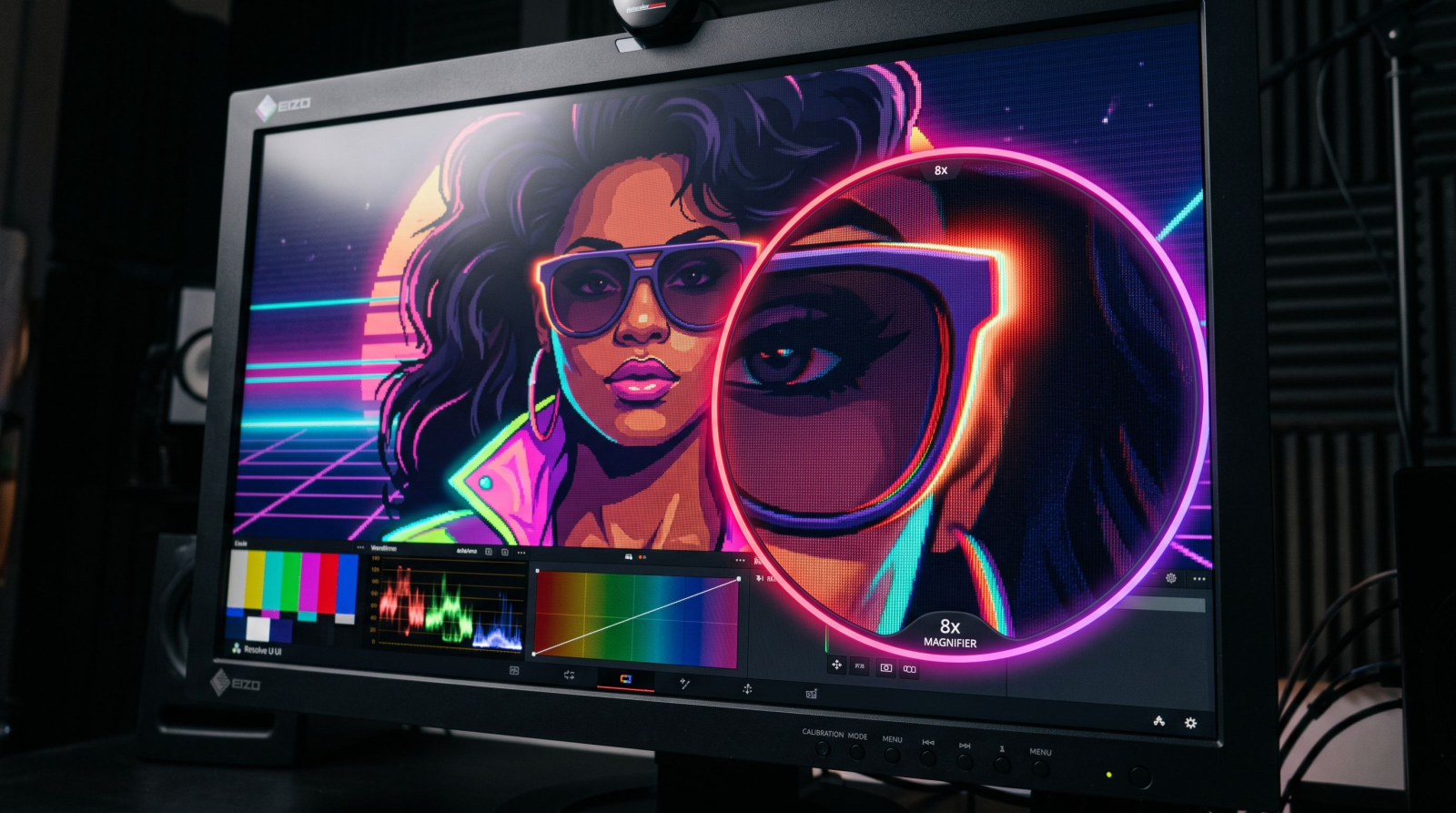
Chromatic aberration is the colored fringe you see along high-contrast edges, usually a thin red or cyan halo where a bright object meets a dark background. Cheap 80s lenses did it constantly. In a prompt, ask for "subtle chromatic aberration on edges" and your image gains that unmistakable analog imperfection. Push it hard and neon signs bleed at the corners, which is exactly what you want for a synthwave cover.
Scan lines
Scan lines are the faint horizontal bands left by CRT televisions and VHS playback. They break up flat areas of color and instantly say "filmed off a tube TV." Pair "visible scan lines" with "VHS tracking distortion" and you get that jittery, taped-off-broadcast feel. This is the core of a convincing VHS filter, and it's the detail people feel even when they can't name it.
Halation
Halation is the soft red-orange glow that blooms around bright light sources on film, think a neon sign, a car headlight, or a window at dusk. It happens when light scatters back through the film base. Prompt for "halation glow around highlights" and your lights stop looking digital and start looking photographed. It's the single fastest way to warm up a cold AI render.
Grain, gels, and faded color
Two more that carry a lot of weight. Film grain ("heavy Kodak Gold 200 grain") adds the texture that flat digital pixels lack. Color gels ("magenta and teal gel lighting") give you that two-tone 80s club glow. And faded color or "lifted blacks, low contrast, sun-faded Kodachrome" recreates a print that's aged in daylight. Stack them and the image stops looking new.
How to build an 80s aesthetic AI prompt, step by step
You don't need to memorize a formula, but a repeatable order helps. Work from the big decision down to the tiny flaw.
Name the year and medium. "1985 department store catalog photo" beats "retro." Specificity is your first and best lever.
Set the subject and wardrobe. High-waisted jeans, a boombox, a bottle of soda with 80s packaging. The props date the frame.
Light it. Add your gels: "magenta key light, cyan rim light, soft haze."
Pick a film stock. "Shot on Kodak Gold 200" or "faded Kodachrome" tells the model the exact color science.
Add the flaws last. Chromatic aberration, scan lines, halation, grain. These are the seasoning, not the meal.
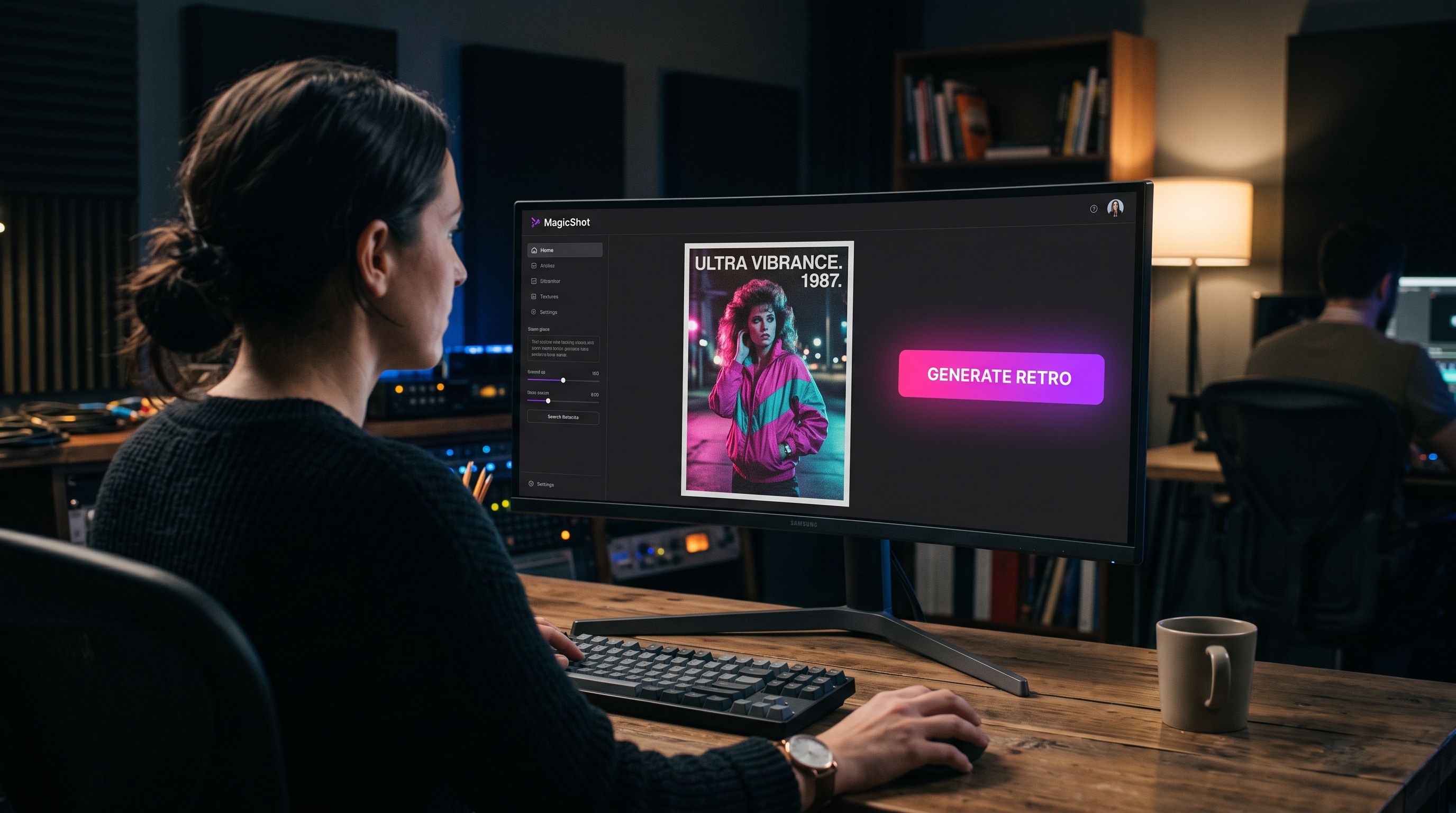
A finished prompt might read: "1987 print ad for a portable radio, model in neon windbreaker, magenta and teal gel lighting, soft studio haze, shot on Kodak Gold 200, subtle chromatic aberration, halation around the highlights, heavy film grain." Run it through an AI art generator and you'll get a frame that looks pulled from a 1987 magazine, not a 2024 render.
Retro isn't just for images: bring it to video
The VHS filter look lives even better in motion. A static grainy photo is nice. A clip with tracking distortion, wobbling scan lines, and a date stamp in the corner is the thing people actually stop scrolling for. That warble as the "tape" struggles to hold sync is half the nostalgia.
If you're making a throwback ad or a music teaser, run your footage through an AI video effects generator to add the grain, glitch, and color bleed in one pass. Want the whole thing generated from a script instead of shot? A text to video workflow lets you describe the retro scene and get moving footage back, then layer the analog flaws on top.
Sound completes the illusion
A retro visual with clean modern audio feels off. Pair your VHS clip with a period-correct synth bed from an AI music generator and the whole thing snaps into place. The ear sells the decade as hard as the eye does.
Where the retro ad style earns its keep
This isn't just a fun filter. It's a positioning tool. Here's where creators and sellers actually reach for it.
Product drops. A modern gadget shot like a 1986 catalog page cuts through a feed of identical white-background photos.
Music and event promo. Synthwave, vaporwave, and 80s tribute nights live and die by neon and grain.
Brand throwbacks. Anniversary campaigns and "then vs now" posts get instant emotional weight from a faded Kodak treatment.
Social content. A VHS filter clip on TikTok or Reels reads as intentional and crafted, not lazy.
If you're building a retro brand from scratch, a matching logo generator run can give you a chrome-and-neon wordmark that fits the whole aesthetic instead of fighting it.
Retro portraits and product shots
The look isn't limited to fantasy scenes. Two everyday use cases benefit the most, and both are worth setting up as a repeatable recipe.
Faces with a period feel
A portrait shot in 80s style needs soft key lighting, a hint of glow, and warm faded skin tones. Push "Kodak Gold 200, soft studio haze, subtle halation" and skip the harsh flaws that fight a face. If you'd rather start from a real photo of yourself and shift it into the era, a set of professional headshots gives you a clean, well-lit base to grade toward that vintage warmth.
Products that look catalog-ready
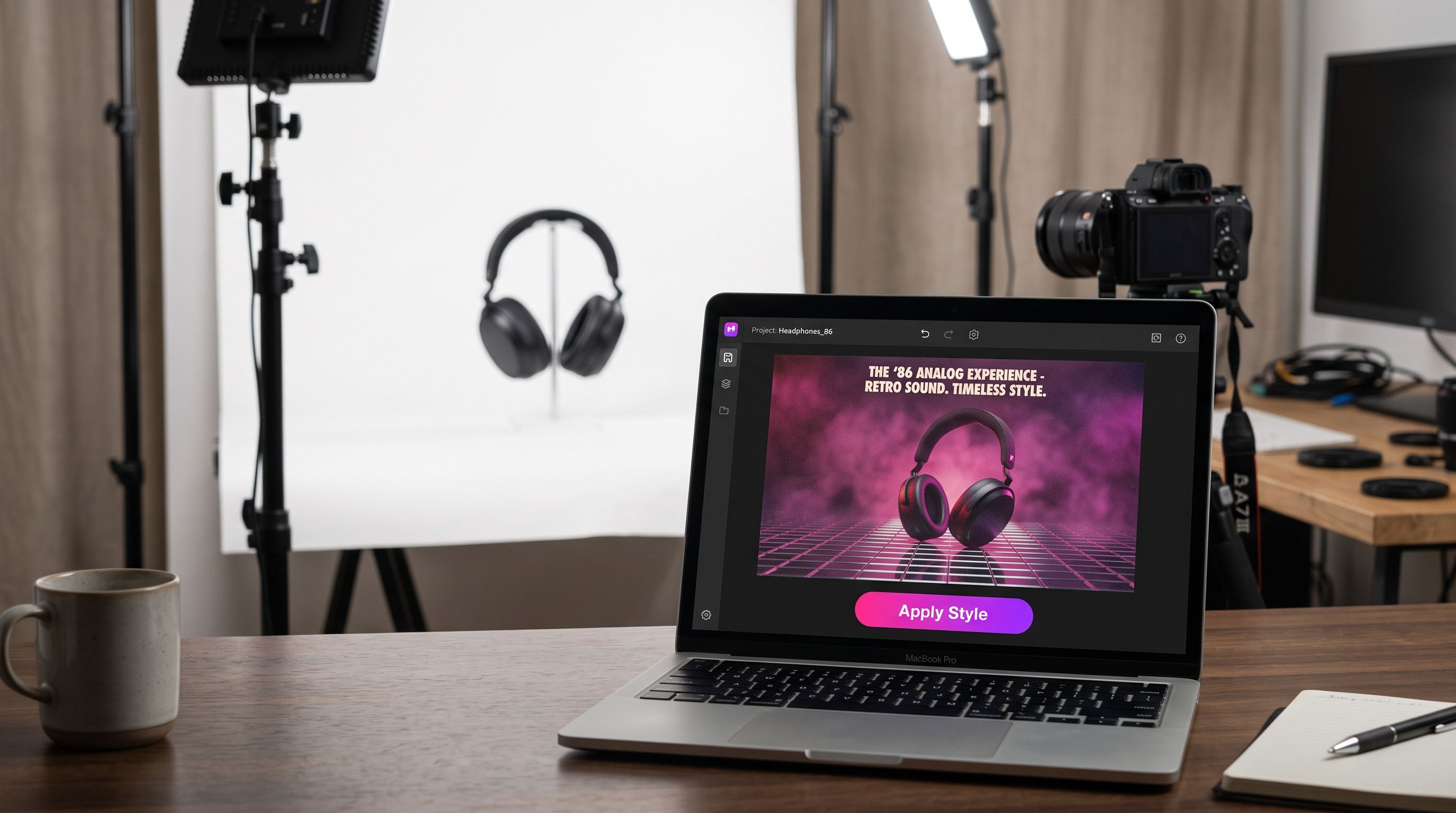
For a retro product shot, the enemy is the flat white background every store uses. Drop your item onto a gradient neon backdrop, add a chrome shelf, and grade with faded color. Clear the original scene first with a background remover so nothing from a modern setting leaks into the 1986 fantasy. The cleaner the cutout, the more believable the era.
Fixing the two things that go wrong
Retro prompts fail in predictable ways, and both are easy to solve.
It looks dirty, not vintage
Too much grain and too many flaws turn a stylish frame into visual noise. Dial back. Use "subtle" and "soft" on your aberration and halation, and let one or two flaws carry the mood. A real 80s ad was still trying to look good.
The color is muddy
Faded doesn't mean gray. If your image goes flat and lifeless, you've killed the neon. Keep the gels saturated and only fade the overall contrast: "lifted blacks, faded Kodak color, but bright magenta and cyan lighting." You want aged, not dead.
Once you land a frame you like but it's soft or small, push it through an image upscaler so the grain stays crisp at full print size instead of turning to mush.
A quick reference cheat sheet
Keep these phrases handy and mix to taste:
Decade signal: "1987 print ad," "VHS home recording," "80s mall catalog"
Lighting: "magenta and cyan gel lighting," "neon glow," "soft studio haze"
Film stock: "Kodak Gold 200," "faded Kodachrome," "expired film color"
Analog flaws: "subtle chromatic aberration," "visible scan lines," "halation around highlights," "VHS tracking distortion," "heavy film grain"
Start with three or four of these, run it, then adjust one variable at a time. That's how you go from a lucky result to a repeatable style you can stamp across a whole campaign.
Wrapping up
The retro ad aesthetic isn't nostalgia for its own sake. It's a shortcut to warmth and personality in a feed full of sterile, over-sharpened images. Learn the four levers, decade, lighting, film stock, and flaws, and you can dial in 80s neon, a proper VHS filter, or a faded Kodak print on demand. No scanner, no expired film, no reshoot. Just the right words and a few careful adjustments.