Icons are small, but a mismatched set is the first thing people notice in an interface. One icon with a thick outline, another with a soft gradient, a third drawn on a different grid, and the whole product feels stitched together. AI icon generators promise to fix the blank-page problem. They do help, as long as you know what they are good at and where you still have to do the work.
What an AI icon generator does
You describe the icon, pick a style, and the tool returns several options. With the AI icon generator you can ask for something like "calendar icon, flat, rounded corners, two colours" and refine from there. Most output is a raster image, so for web UI you will often convert it to a clean vector afterwards.
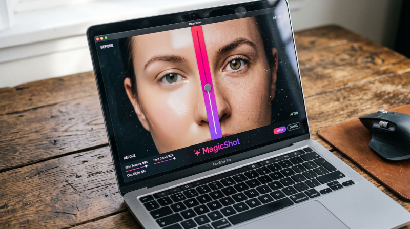
For a wider look at the category, see our list of the top AI icon generators, and browse the rest of the MagicShot features if you also need images or video for the same project.
Where it genuinely saves time
Early exploration. Ten visual directions for a settings icon in a minute, instead of one sketch in an hour.
App icons and store graphics. Good for first concepts. Remember the App Store needs a 1024 x 1024 px icon and Google Play asks for 512 x 512 px, so start large and keep the shape simple.
Illustrated feature icons. Marketing pages and onboarding screens, where a little character is welcome.
Placeholder sets. Something better than grey boxes while the real design system is still being built.
Where it needs a human
Consistency. A UI set needs one stroke weight, one corner radius, and one grid, usually 24 x 24 px. Generators produce each icon independently, so the set drifts. Generate them with the same style words, then compare side by side and redraw the outliers.
Small sizes. An icon that looks great at 512 px can turn to mush at 16 px. Always test at the real size, on a light and a dark background.
Meaning. Users read icons by habit. A magnifying glass means search; a clever new metaphor means confusion. Use the familiar symbol unless you have a good reason.
Accessibility. Icons alone are weak signals. Pair them with a label or an accessible name, and check colour contrast.
A simple workflow
1. List the icons you need and the one thing each must say.
2. Pick a style sentence and reuse it for every prompt, for example "outline, 2 px stroke, rounded ends, single colour".
3. Generate several options per icon and choose the one that reads best at small size.
4. Trace or redraw the winners as SVG so they scale cleanly and the file stays light.
5. Line them up on a 24 px grid, fix the stroke and corner radius, and export.
Rights and quality checks
Read the licence for commercial use, especially for app store icons and branding. If an icon is part of your logo, treat it as a trademark asset: make sure it does not closely copy another brand's mark, and keep your edit files as proof of how it was made.
Should you use one?
If you need ideas fast or lack an illustrator, yes. If you need a polished system for a product that will live for years, use the generator for first drafts and finish by hand, or buy a proven icon set and customise it. The tool is a fast start, not the finish line.