
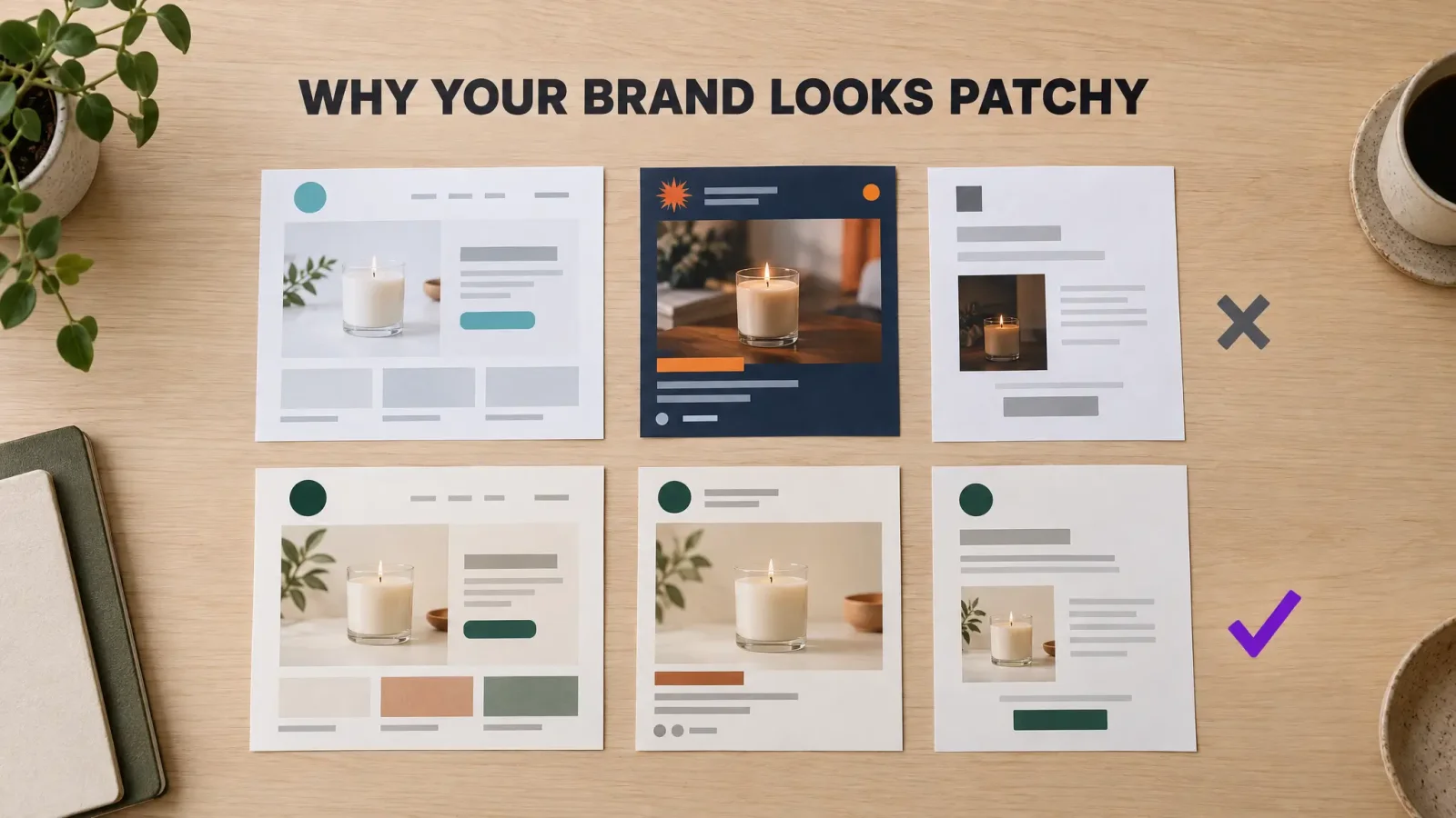
There is a specific kind of frustration that shows up a few months after launch. You have a logo you like. The Instagram posts look decent one at a time. The website passed the "would I buy from this" test. And yet, when you open the shop, the feed and the last order email in three tabs side by side, something is off. It looks like three different people made them.
One Shopify seller put it better than I can. After months spent on a logo, a palette and product photos, Techspawn2 wrote that the whole thing still read as "patchy. Like a brand that was still figuring itself out." The pieces were fine. The brand wasn't.
This post is about that gap, why customers feel it before you do, and the smallest set of decisions that closes it. No designer on retainer required.
What "patchy" actually looks like
I went through a few long threads where store owners described the problem in their own words. The symptoms repeat.
A fragrance founder, posting as riyancode, said the hard part was never writing captions. It was "colors, layouts and overall feed harmony," which got worse the more often they posted. A seller called bchen27 described a catalog with "a mix of iPhone shots, supplier images, and a few professional photos from an early shoot," and said "the whole store felt disjointed." Kim267 made small improvements over a year, each one sensible, and ended up with a store where "it felt like different people had worked on different parts."
Notice none of them had a bad logo. The logo is almost never the problem. The problem is that a logo is one decision, and a brand is a few hundred small ones made over months, usually at 11pm, usually without checking what you decided last time.
Why customers feel it before you do
You see your brand every day, so your brain fills in the gaps. A first-time visitor has no gaps to fill. They see a teal button on the site, a navy template on Instagram and a plain grey order email, and they do a quick, unconscious sum.
A Shopify power user, diego_ezfy, called this "brand anxiety on the customer's side. Subconsciously they're asking 'who actually is this?'" Until that question gets the same answer everywhere, trust builds slowly, and slow trust shows up as abandoned carts and silence after the first order.
The flip side is cheap to buy. Techspawn2 again, on the moment things clicked: "The moment our packaging, our emails, our social posts, and our website all started feeling like they came from the same place customers started treating us differently. More trust. More repeat purchases. More people tagging us when they received their order."
Nothing about the individual assets changed. They just started agreeing with each other.
The fifteen-minute brand audit
Before fixing anything, find out how patchy you really are. This takes a quarter of an hour and usually stings a little.
Open everything a customer might see, in this order: your website homepage, one product page, your Instagram grid, your last three posts individually, your order confirmation email, a shipping notification, your packaging or a photo of it, your email signature, your Google Business or marketplace listing if you have one.
Now count. How many distinct logo versions are in use? How many colors that are "sort of" your brand color but not quite the same hex? How many fonts? How many photo styles (white background, lifestyle, phone snapshot, supplier render)?
Most small brands I've seen land somewhere around three logo variants, six to nine colors, four fonts and three or four photo styles. If your numbers look like that, you don't have a design problem. You have a decision problem. The fix is to make each of those decisions once and write it down.
The small system: two fonts, four colors, five templates, one photo rule
Here is the part where most branding advice gets greedy and tells you to write a forty-page brand book. Don't. Startups skip brand guidelines for a good reason, which a marketing director summed up on Quora as "a lack of resources: time, money, staff." A big document you never open is worse than no document.
What you need fits on one page.
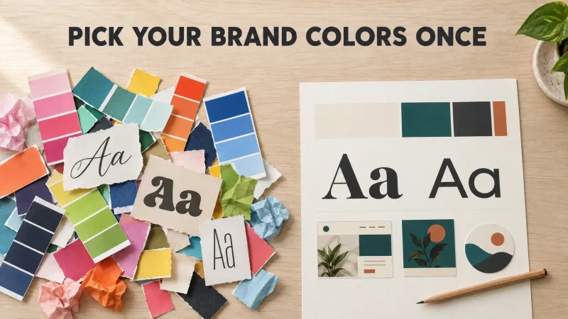
Two fonts. One for headings, one for body text. A Shopify Partner in the fragrance thread gave the plainest version of this rule: "pick 2-3 main colors and 2 specific fonts, and stick to them no matter what." The "no matter what" is the important bit. The temptation to use a fun third font for a sale banner is exactly how patchiness starts.
Three or four colors, each with a job. A primary color that carries the brand, a secondary for accents and buttons, and one or two neutrals for backgrounds and text. Give each one a role, not just a hex code. "Primary: buttons, logo, highlights. Neutral dark: all body text." Every extra color you add is one more thing that can be applied inconsistently, so stop at four.
Five post templates. Product spotlight, customer review, announcement, behind the scenes, and a text-only quote or tip. Build them once with your two fonts and four colors. From then on you swap the photo and the words. Your feed stays harmonious without you thinking about harmony.
One photo rule. This is the one sellers most often skip and the one with the biggest payoff. bchen27 standardized "every product image to the same style, lighting, and background treatment," and said customers "started treating us like a real brand instead of a random store." Their verdict on the effort: "way more impactful than the logo redesign we wasted two months on." Pick one background, one lighting mood, one crop. Reshoot or regenerate anything that breaks the rule.
The layer nobody writes down: voice
Visual consistency gets you most of the way. The last stretch is how you sound.
diego_ezfy made the point that colors and typography "are easy to copy-paste. Voice takes actual decisions about what you stand for and how you talk to people." If your product descriptions are warm and your shipping emails read like a tax notice, the customer notices the seam even if they can't name it.
A voice document is shorter than you think. Three adjectives you want to sound like. Three you never want to sound like. Five phrases you actually use. Five you'd never use. That's it. Tape it next to the color page.
Where AI helps, and where it quietly makes things worse
A lot of the sellers in these threads were already using AI to produce posts and images, and their experiences split cleanly.
Used without constraints, AI makes patchiness worse, not better. One seller who tried generating social imagery with a general chatbot found that "no matter how much I tweak them, I ultimately still need a UI designer to redesign the visuals—the AI-generated images just feel too 'AI-like.'" Another partner warned that it's "still quite hard to get AI to generate the exact same style every time." Every generation is a fresh roll of the dice, and dice don't do consistency.
Used inside a system, it flips. Once your fonts, colors and layouts are fixed, the AI has far less room to drift. One commenter in the same thread put it this way: with the core set, "even AI-generated posts stay on-brand because the system constrains them."
So the order matters. System first, then automation. Automation first just produces patchiness faster.
How Brand Studio does the system part for you
This is the problem we built Brand Studio for, so here is exactly what it gives you and what it doesn't.
You describe your business in a sentence or two, pick a few moods, and optionally start from a logo or photo you already have. Brand Studio comes back with several complete looks. Each one is the whole system at once: a logo set in SVG and PNG for light and dark backgrounds, a color palette with roles already assigned, a display and body font pair, social media assets, business cards, letterhead and an email signature, and a brand guide as both a PDF and a web page. You can change colors, fonts or wording, with undo and version history, and download it all as one ZIP.
That one-page brand guide is the thing every seller above eventually built by hand. You just get it on day one, which means your first post and your first order email already agree with each other.
Two more things that matter for the patchiness problem specifically. Your brand carries into the other MagicShot tools, so when you generate product photos or thumbnails they inherit the same palette and type instead of starting from scratch. And there's a design checker: upload a post or a banner and it tells you whether it matches your brand kit before you publish. It is a small feature, but it is the one that stops the 11pm third font.
Brand Studio runs on the credits in your MagicShot plan. You see the cost of each step before you confirm, and if a step fails the credits come back automatically.
Build your brand kit in Brand Studio
What to do this week
Run the fifteen-minute audit and write the counts down. Pick two fonts and four colors, give each color a job, and put them on one page with a short voice note. Rebuild your five most common post types as templates. Pick one product photo rule and start applying it to new photos, then work backwards through the catalog. Then stop. Resist the rebrand. As one seller who had been through it said, "If I could redo it, I'd focus earlier on a simple system that stays consistent rather than chasing 'perfect' assets."
Consistency is not the glamorous part of branding. It is the part customers actually feel.