
A post in the Shopify Community, typos and all, says what most people are actually thinking when they search this: "Im wanting to start a brand but I've never done anything like any of this really allmi have is a brand name and what the brand is about thats it i don't knoe the first thing about how to make this happen."
That is the real starting line. Not "define your brand pillars." A name, an idea, no design training, and no clue what comes next.
Another poster in the same forum, Kyle, said the quiet part: "I know that I'm a terrible designer with no training, so I want to invest my time in learning the basics, so I can reliably leverage AI to help me, instead of being fully dependent on it or a consultant."
This is the order I'd give both of them. Eight steps, roughly a weekend, and most of it is deciding rather than designing.
First, a fair question: should you even do this yet?
Some experienced people will tell you not to bother. Mark Mehling, a marketing strategist with forty years in, answered the Quora question "Why don't startups use a brand style guide?" with: "Because it's generally wasted time and money and effort. Startups evolve, change directions and even names." His closer: "Startups need priorities. And a style guide would be a distraction."
Stephanie Stocker, a marketing director, was gentler but agreed on the cause: "Startups are almost always facing a lack of resources: time, money, staff." Her point is that branding elements tend to "come out of that early grassroots work," and the formal exercise happens later.
They are right about brand books. They are wrong if you read them as "skip branding." Tejus Wadbudhe, a product manager, put the counter well: "branding is not something that disappears just because you don't build it. It's always there. It's people's perception of you."
So the goal at launch is not a forty-page document. It is the smallest set of decisions that stops your first customers from forming a patchy impression. Everything below is sized for that.
Step 1: write the sentence
Before any visuals, write one sentence: what you sell, who it is for, and the one thing that makes you different. If you can't fill the third slot yet, write the first two and come back.
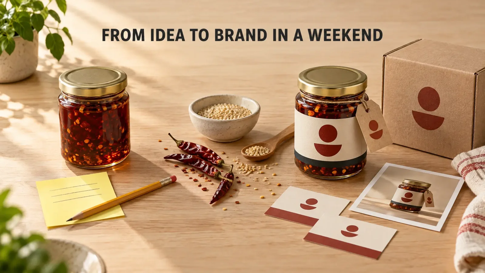
"Small-batch chilli oil for people who cook on weeknights and want one jar that does everything."
That sentence is the brief for every decision that follows. It is also, not by accident, exactly what an AI brand tool needs from you. Brand Studio's first step is literally "describe your business in a sentence or two," so writing it well here saves you from staring at an empty box later.
Step 2: check the name before you fall in love with it
Three checks, twenty minutes.
Can you get the domain, or a close variant you can live with? Can you get the handle on the one or two social platforms you will actually use? Does a search for the name on the USPTO's trademark search tool turn up a live mark in your category?
If any answer is no, fix the name now. It is the cheapest change you will ever make, and the most expensive one to make later. The cost post goes into the fee side of trademarks if you want the numbers.
Step 3: a logo system, not a logo
First-timers spend the most time here and get the least from it. A seller on Shopify, Techspawn2, described spending "months obsessing over our logo, color palette and product photography," and concluded the thing that actually changed how customers saw the brand was none of them. Another, bchen27, called their redesign "the logo redesign we wasted two months on."
What you need is not a perfect mark. It is a small set: the logo on a light background, the logo on a dark background, and a one-color version that survives being printed in black on a brown box. If you have a wordmark, you need it at sizes from a browser tab to a sign. That is a system. One beautiful PNG is not.
Step 4: three or four colors, each with a job
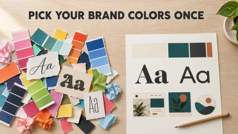
A primary color that is the brand. A secondary for accents. One or two neutrals for text and backgrounds. Write down the hex codes and the job each color does, because "that teal" is how inconsistency starts.
There is a whole post on choosing them, with the rules designers actually use. The short version is: decide on personality first, look at what your category already uses, pick something that sits next to it rather than on top of it, and test the primary color as a button before you commit.
Step 5: two fonts
One for headings. One for everything you read. Clearly different from each other. No third font, ever, not even for the holiday sale. Mayank_bisht's guidance in a Shopify thread was "2-3 fonts, 4-5 colors, and a couple of recurring layout templates. Once those are set, even AI-generated posts stay on-brand because the system constrains them." Take the low end of each.
Step 6: five templates and one photo rule
Now the decisions become things you can reuse. Build five post templates from your colors and fonts: product, review, announcement, behind the scenes, text-only tip. And set one product photo rule: one background, one lighting mood, one crop. bchen27 again, on standardising product photos: customers "started treating us like a real brand instead of a random store."
This is also the point where a brand stops being a folder of files and starts being a habit.
Step 7: put it on one page
Logo variants, four colors with jobs, two fonts with jobs, three adjectives for how you sound, three you avoid. One page. Henry Collins, who rebranded after launch and regretted the timing, said: "If I could redo it, I'd focus earlier on a simple system that stays consistent rather than chasing 'perfect' assets." This page is that system.
Step 8: apply it everywhere at once
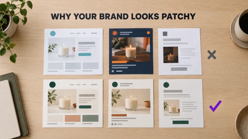
Website header, product pages, social profiles, your order confirmation email, your packaging or label, your email signature. All on the same day if you can. The impression customers form comes from the whole set agreeing, and the "why does my brand look patchy" problem is almost always a brand that was applied to one surface at a time over six months.
Three ways to get through steps 3 to 7
Do it yourself with free tools. Cheapest, slowest, and you make every decision alone. Fine if you enjoy it. Budget a few weekends.
Hire a designer. A freelancer's identity package runs roughly $400 to $2,500 and takes a couple of weeks. You get a professional making the calls, which is worth it once you have revenue to protect.
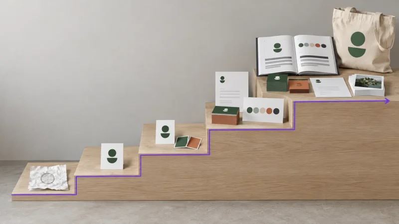
Generate the whole system with AI, then adjust. This is what Brand Studio is for. You write the sentence from step 1, pick a few moods, and optionally upload a logo or photo you already have. You get several complete looks, each with its own logo, colors and fonts chosen together. Pick one, change anything you don't like with undo and version history, and download the kit as one ZIP. The kit is steps 3 through 7 in one go: logo system in SVG and PNG for light and dark backgrounds, palette with roles, display and body font pair, social media assets, business cards, letterhead, email signature, and the one-page brand guide as a PDF and a web page. Credits are shown before each step, and a failed step refunds them.
What it won't do is write your sentence or check your name. Those are yours.
Build your first brand kit in Brand Studio
The mistakes first-timers make
Starting with the logo. It is step 3 for a reason. Without the sentence, you are picking shapes you like, and you will change your mind.
Generating a logo and stopping. A founder on Indie Hackers described watching people use AI logo makers "and still end up stuck. They had a logo, sure. But then came the real work: What colors should I use? Which fonts fit the brand? What should the website look like? How do I make social posts consistent?" A logo is a tenth of the job.
Rebranding at the first wobble. diego_ezfy, a Shopify power user, warned he'd "seen stores rebrand twice in a year chasing trends and the inconsistency made things worse, not better." His rule for when a rebrand is right: "If the first version was patchy because you genuinely didn't know your customer yet, a rebrand after you do know them makes total sense." Otherwise, apply what you have more consistently and wait.
Overbuilding. Paul Gobat, who has answered thousands of these questions on Quora, argues that for most small businesses an expensive logo is "a waste of money" because the value of a logo comes from impressions, and you don't have many yet. He is right about the spend. Build small, then grow it.
This weekend
Saturday morning: the sentence and the name checks. Saturday afternoon: logo system, colors, fonts, whether you generate them or draw them. Sunday: five templates, one photo rule, the one-page guide. Sunday night: apply it to every surface you have. Then sell something and leave the brand alone for a while. It will look like a real brand sooner than you expect, mostly because it will look like the same brand everywhere.