
Someone asked this on Quora, and I think it is the most honest version of the question: "How can I choose my brand colours and how many colours should it be and should I use them in every single detail?"
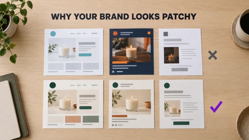
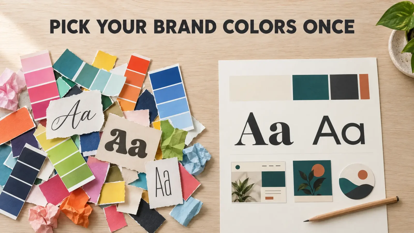
Three questions in one, and underneath them a fourth that nobody types out: how do I stop changing my mind? Because that is the real problem. Most small brands don't have bad colors. They have five palettes, one for every mood the founder was in, and a different font every time a sale banner needed "a bit more energy."
This is a method for deciding once. It borrows the rules working designers gave in those threads, and it ends with the decisions written down, which is the part that actually stops the second-guessing.
Start with personality, not a color picker
Every designer in those threads said some version of the same thing, and every founder skips it. Yunus K, who has built brand identities for years, put it as his first rule: "Define the brand personality first, then use color to reflect it." His complaint is that people treat it as "choosing a hue someone 'likes'."
Robert Hampson made the same point from the customer's side with a line I keep thinking about: "you don't choose bright colours if you are an undertaker."
So before you open anything, write five adjectives. Not "modern, clean, professional," which every brand on earth claims. Specific ones. "Calm. A little nerdy. Expensive but not showy. Direct. Warm." Then write the two you are not: "Not playful. Not loud." Now you have a brief, and your colors have something to be right or wrong about.
How many colors should a brand have? Three or four
This is the question people argue about and the answer is boring. Chetan Preet on Quora: "For most businesses: three to four. A primary colour, a secondary colour, and one or two neutrals." His reasoning is the part worth remembering: "every new colour you add is one more thing that can be applied inconsistently."
A Shopify Partner in a thread about solo founders said "pick 2-3 main colors and 2 specific fonts, and stick to them no matter what." Another commenter in the same thread allowed "4-5 colors" as the upper limit. Nobody serious said seven.
Give each color a job, because a palette without roles is just a mood board:
Primary. The one color that is your brand. Logo, buttons, the thing people remember.
Secondary. Accents, highlights, a second button style. Used less than you want to use it.
Neutral dark. All body text. Usually not pure black.
Neutral light. Backgrounds. Usually not pure white.
If you have heard of the 60-30-10 rule, that is roughly this: about 60 percent of any surface is your light neutral, 30 percent is primary or dark neutral doing the structural work, and 10 percent is the accent. The numbers are not sacred. The ratio is. When the accent starts covering half the page, that is when a brand starts to look like a sale flyer.
Picking the actual colors
Now the part everyone wants to start with.
Check the category first. Poojitha Borra, answering as a shopper rather than a designer, suggested going to the aisle: "imagine your product on the shelf. Then pick the colour that would showcase your product and would draw a consumer's attention." Do the digital version. Open the ten brands your customer would compare you to and screenshot their homepages into one grid. You will see the category's default color immediately. Sometimes you want to join it, because customers use color to recognise what kind of thing you are. More often for a small brand you want to sit next to it, not on top of it.
Watch for the AI default. If you sell anything that touches software or AI, there is a specific trap. Michal from Hyzo wrote a long post on why every AI brand looks the same: purple, gradients, glows. His diagnosis is that "purple in AI... is more of a metaphor than a natural association and that is why it wears out faster." His fix is useful for any category: a cliché color "works best when it is balanced with something human: a light background, simple language, transparency, warmth and specificity." If your competitor grid is a wall of purple gradients, a warm neutral and one confident flat color will do more for you than a seventh shade of violet.
Test on real surfaces, not swatches. A color that looks great as a square looks different as a button with white text on it, as a background behind a product photo, and as a printed sticker. Before you commit, mock up three things: your site header, one Instagram post, one business card or label. If the primary color fails as a button, pick a different one. This is where most "I love this palette" choices die, and better now than after printing.
Write the hex codes down. Not "that teal." The six characters. Put them in the same file as the adjectives.
Fonts: two, with jobs
Fonts cause more second-guessing than colors because there are more of them and they all look fine in the preview.
The rule is two. One display font for headings and the logo wordmark if you have one. One body font for everything you actually read. Mayank_bisht's version in the Shopify thread was "2-3 fonts," which I would read as two plus permission to use a bold weight.
How to pair them without a design degree:
Make them different in one obvious way. A serif heading with a sans-serif body, or a wide geometric heading with a narrow humanist body. Two fonts that are almost the same look like a mistake.
Let the body font be boring. Its job is to disappear. If you can name it from across the room, it is the wrong body font.
Test the body font at phone size, on your own site, in a paragraph of real copy. A lot of fonts that look elegant at 48 points turn into grey mush at 15.
Check the display font has the characters you need. Numbers that look right on a price. A proper ampersand if your name has one. Accents if you sell in more than one language.
And then the hard part: no third font. Not for the sale. Not for the holiday post. If the brand needs more energy, use the display font bigger, or the accent color, or an actual photo. A third font is how patchiness starts, and once it is in, it is in.
The one objection worth hearing
Paul Gobat, who has answered a frankly absurd number of branding questions on Quora, disagrees with all of the above in a way that is worth a paragraph: "Your brand should not be reliant on colours OR lettering. Your brand should be instantly recognizable regardless of size, colour, and should not have to rely on reading anything." His example is the bent-fry McDonald's mark on a cup lid.
He is right, for McDonald's. A small brand doesn't get a billion impressions a month, so color and type do a lot of the recognising for it. The useful version of his point is this: make sure your logo still works in one color on a dark background, because at some point it will be printed on a brown box in black ink. Brand Studio exports logos for light and dark backgrounds for exactly this reason. But the colors and fonts are not optional on top of that. They are the brand, most days.
Can ChatGPT pick my palette?
People search this, so, honestly: it can give you a plausible palette in ten seconds, and it will give the next person a nearly identical one. General chatbots lean on the same handful of safe combinations, which is how you end up with the purple problem above.
The better use of AI is not "pick colors" but "show me the whole system three ways." That is what Brand Studio does. You describe the business and pick a few moods, and it comes back with several complete looks. Each one is a logo, a color palette with the roles already assigned, and a display and body font pair that were chosen together, so you are judging combinations instead of individual swatches. You then adjust whatever you want, with undo and version history, which is a kinder way to second-guess than redoing the whole thing. When the kit is done, the design checker tells you whether a new post or banner actually uses the palette and fonts you chose, which is how the "no third font" rule survives contact with a Tuesday.
See a full color and font system in Brand Studio
Write it on one page and stop
Here is the whole deliverable. It fits on a single page and takes twenty minutes once the choices are made.
Five adjectives, two anti-adjectives.
Four colors with hex codes and a job each.
Two fonts with a job each, plus the one bold weight you allow yourself.
Three mockups proving they work: header, post, label.
The date you decided.
That last line sounds silly and is the most important one. When the urge to change comes, and it will, look at the date. If it has been less than a year and nothing about the business has changed, the urge is boredom, not a brand problem. Your customers are not bored of your colors. They have barely started noticing them.