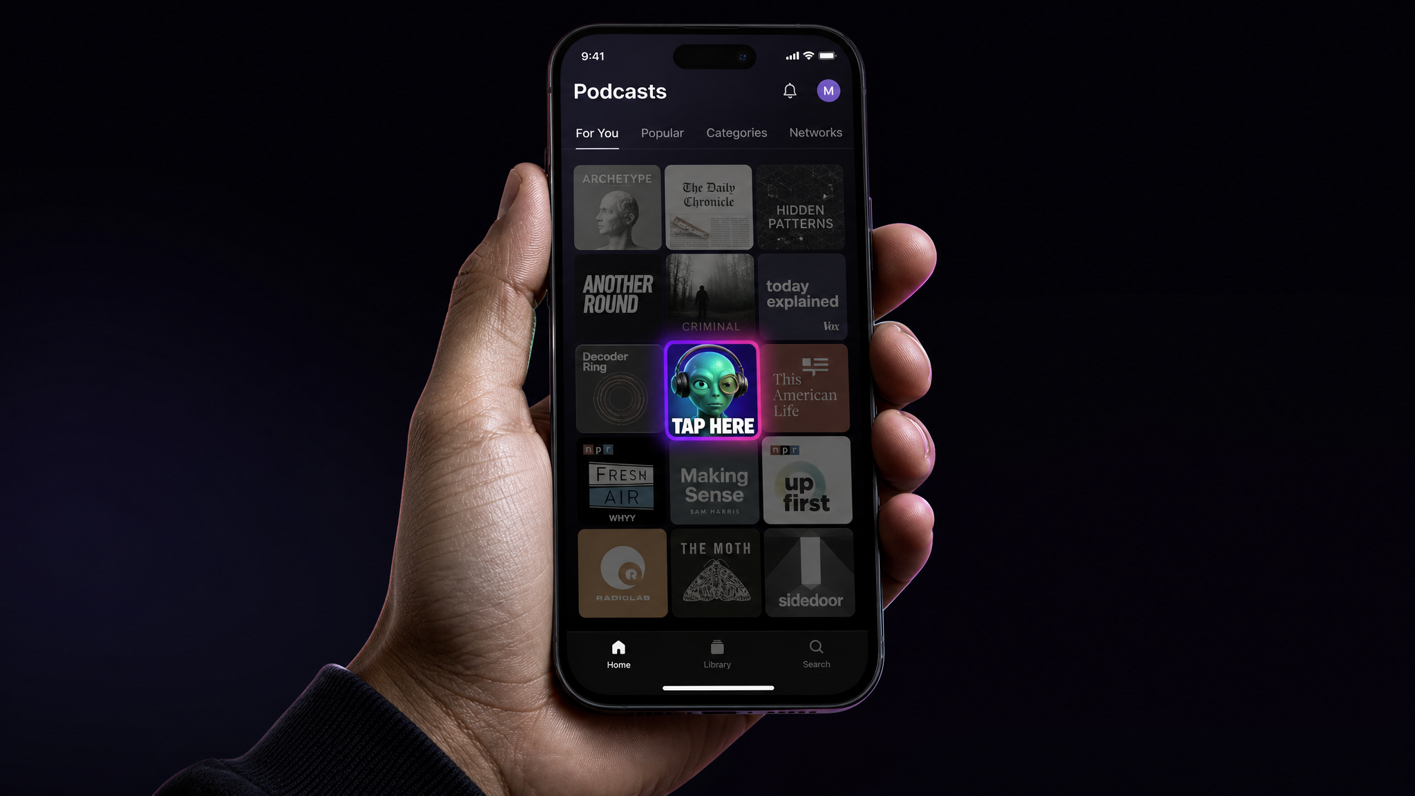
A podcast cover has about one second to earn a tap. It sits at 55 by 55 pixels in a crowded Apple Podcasts feed, next to a thousand shows fighting for the same thumb. Getting it right used to mean a designer, a brief, and a two-week wait. A cover art generator powered by AI collapses that into a few minutes, and it does the same for the audiograms you post to promote every episode. This guide covers the exact artwork specs Apple and Spotify want, how to make cover art and audiograms with AI, and the mistakes that get shows rejected.
What a podcast cover art generator actually does
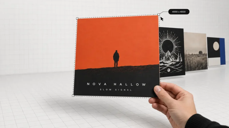
A podcast cover art generator turns a short text prompt or an uploaded image into square artwork built for podcast directories. You describe the show, the mood, and the colors, and the AI returns cover options sized for the 3000 by 3000 pixel canvas that every major platform accepts. No Photoshop, no stock-photo license, no waiting on a freelancer's third revision.
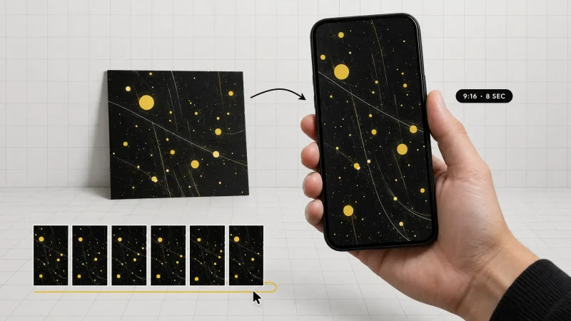
The audiogram side handles promotion. An audiogram is a short video clip of your episode audio paired with a waveform, captions, and your artwork, built to autoplay in a social feed. Instead of posting a static link nobody clicks, you post 30 seconds of your best line moving on screen. Both jobs, the cover and the clip, replace tools and subscriptions you would otherwise stack up.
Podcast artwork size: the exact Apple and Spotify specs
Directories reject artwork that fails validation, so the numbers matter. Here are the current requirements.
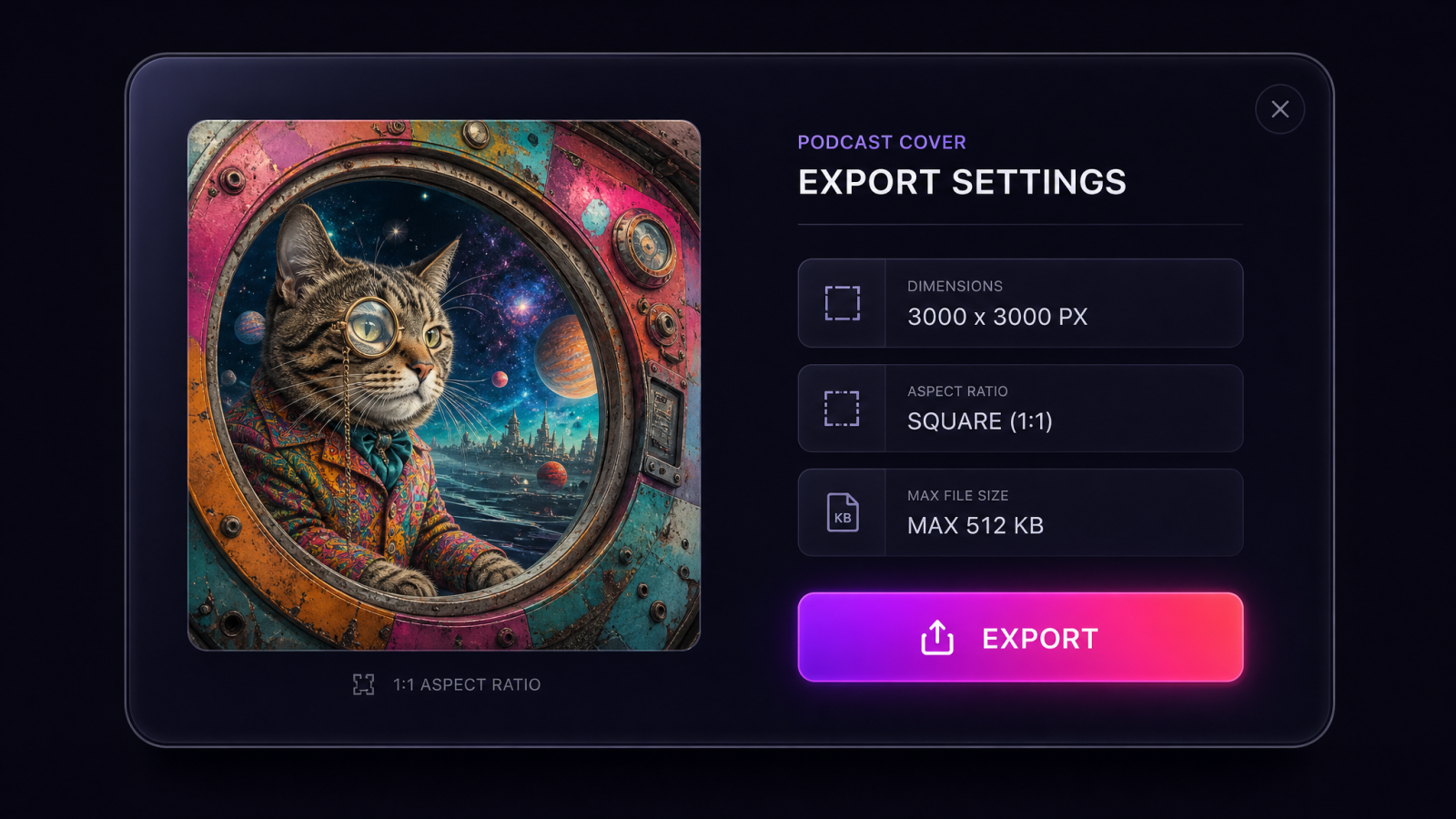
Recommended size: 3000 x 3000 pixels, square (1:1).
Minimum size: 1400 x 1400 pixels. Below this, Apple will not accept the feed.
File type: JPEG or PNG.
Color space: RGB.
Resolution: 72 dpi.
Maximum file size: 512 KB.
Design at 3000 x 3000 and you cover Apple Podcasts, Spotify, Amazon Music, and YouTube Podcasts in one export. The number that trips people up is file size. A busy 3000 pixel PNG can blow past 512 KB fast, so save as JPEG at around 90 percent quality, or run the file through a compressor before you upload. If it still won't shrink, drop the pixel dimensions a step while staying above the 1400 minimum.
Audiogram sizes by platform
Audiograms are not square by default. Match the aspect ratio to where you post so the clip fills the frame instead of floating in gray bars.
Square (1:1), 1080 x 1080: Facebook, X, and the Instagram feed.
Vertical (9:16), 1080 x 1920: Instagram Stories, Reels, and TikTok.
Landscape (16:9), 1920 x 1080: YouTube.
You cannot ship one file to every platform and expect it to look native. Export the format that fits each feed, and keep the captions large enough to read on a phone held at arm's length.
How to make podcast cover art with AI in three steps
The workflow is short on purpose. You are making something that reads at thumbnail size, not a magazine spread.
1. Write a prompt that names the vibe
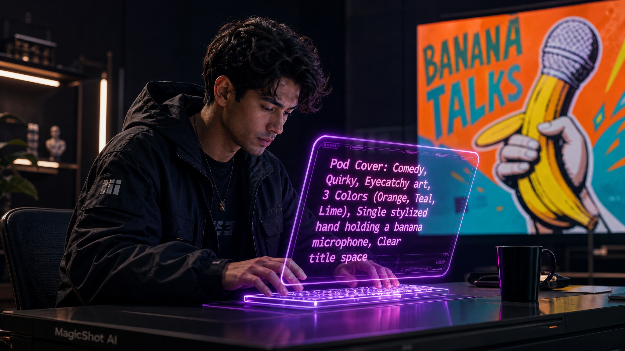
Skip vague adjectives. Name the genre, the mood, two or three colors, and any object that signals your topic. "True-crime podcast cover, moody navy and gold, single city skyline at night, bold serif title space" gives the model something to work with. If you have a photo of the host, upload it and let the generator build around it.
2. Generate, then pick for the thumbnail
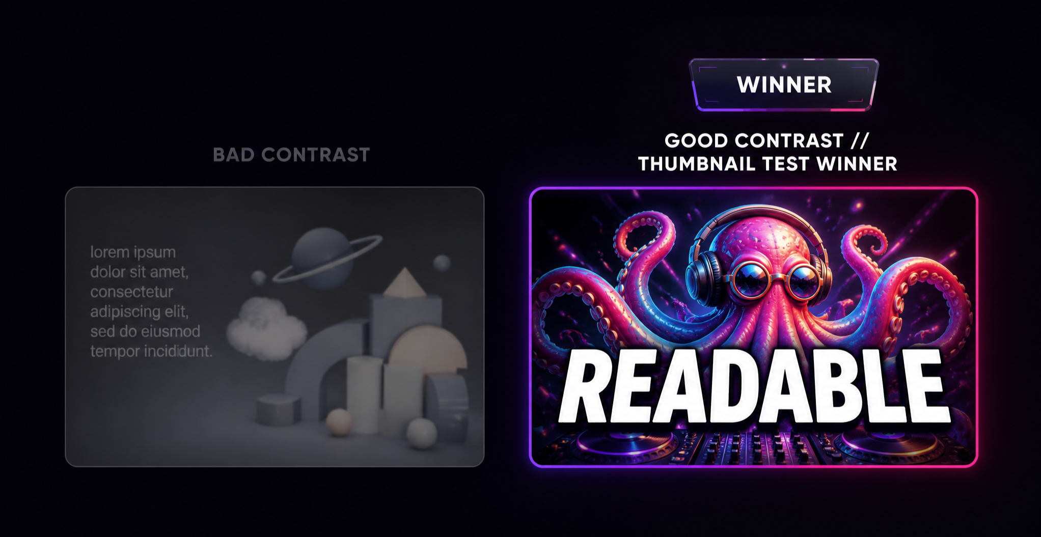
Review your options at small size before you fall for the full-resolution version. Shrink each one to about 60 pixels wide. The winner is the one you can still read and recognize. A great big image that turns to mud at thumbnail size is a bad cover.
3. Add the title and export at 3000 x 3000
Keep text to the show name and maybe a five-to-seven word tagline. Use one or two fonts, high contrast against the background, and export a square JPEG under 512 KB. That file is ready for your host's RSS feed.
Turning episodes into audiograms with an audiogram maker
An audiogram maker takes a slice of your episode audio and wraps it in visuals that move. The recipe that performs: a 20 to 40 second clip of your sharpest moment, a waveform or bars that react to the sound, burned-in captions, and your cover art or a still of the guest. Captions do the heavy lifting, since most feeds autoplay muted.
Pick moments that stand on their own. A surprising stat, a hot take, a laugh line. The clip should make sense to someone who has never heard your show. Post the vertical cut to Reels and TikTok, the square cut to the feed, and pin the best one to your profile the week an episode drops.
If you want narrated intros or extra voiceover for these clips, MagicShot's text to speech tool can generate a clean read from a script, and the AI music generator gives you a background bed you can post without a licensing headache.
AI handles the pixels, but you still make the calls that decide whether the cover works. A few hold true across every genre.
Read at thumbnail size. If the title disappears at 55 pixels, redesign. This is the single most common miss.
Limit the words. Five to seven words total. The show name is usually enough. Episode numbers and URLs do not belong on the cover.
Two fonts, maximum. Pair a serif with a sans-serif if you use two, and skip decorative faces that fall apart when small.
Contrast the text. Light title on a dark field, or the reverse. Mid-tone on mid-tone is invisible in a feed.
Stay inside Apple's content rules. No misleading logos, no platform trademarks, no explicit imagery unless the show is marked explicit.
If your cover leans on a photo, clean it up first. A quick pass through MagicShot's background remover lets you drop a host portrait onto a solid color, and the image upscaler pushes a smaller source photo up to the 3000 pixel canvas without turning soft.
Where a podcast cover art generator fits your wider toolkit
Cover art rarely travels alone. The same show usually needs a wordmark, guest headshots, and a set of channel graphics, and the AI tools that make the cover, cover those jobs too. If you are building a brand mark for the show, the logo generator gives you a version that scales from the cover down to a favicon. For host and guest photos that match across every episode graphic, professional headshots keep the look consistent without a photographer on retainer.
The cover generator itself is close cousin to a couple of other MagicShot tools. Authors turning a book into a podcast can reuse the visual language from the book cover maker. For fully custom art direction, the AI art generator gives you the most control over style and composition.
Prompts that produce covers worth tapping
The gap between a flat cover and one people click usually lives in the prompt. Generic inputs give generic art. The fix is to feed the generator the same brief you would hand a designer: genre, mood, palette, subject, and where the title sits.
Compare these two for a business interview show. A weak prompt reads "podcast cover about business." A strong one reads "business interview podcast cover, warm cream background, minimal geometric shapes, deep burgundy accent, clean sans-serif title space at the top, professional and calm." The second gives the model direction on color, layout, and tone, so the output needs far less trial and error.
Name a palette, not just a color. "Teal and burnt orange" beats "colorful." Two or three colors keep the cover coherent at small size.
Say where the title goes. Asking for "clear title space at the top" leaves room for text instead of a busy image you have to fight.
Match the genre's visual code. True crime leans dark and high-contrast, comedy leans bright and loose, wellness leans soft and airy. Signal it in the prompt.
Add one topic object. A microphone, a skyline, a plant, a chess piece. A single recognizable element tells listeners what the show is about before they read a word.
Keeping every graphic on brand
A show is not one image. It is the cover, the audiograms, the guest cards, the channel banner, and the thumbnails, and they all need to look like the same show. Once your cover locks in a palette and a font, reuse both everywhere. That repetition is what makes a feed of clips feel like a brand instead of a pile of random posts.
Pull the cover's colors into your audiogram backgrounds. Use the same title font for caption headers. If you feature guests, run their photos through the same treatment so a stranger scrolling your grid sees one consistent look. When you need moving promos beyond audiograms, MagicShot's image to video tool animates a still cover into a short teaser, and the text to video tool turns an episode summary into a trailer clip for the feed.
Cover and audiograms, start to finish
Here is the fast path for a new show. Generate three or four square covers from a prompt, judge them at thumbnail size, add the title, and export a JPEG under 512 KB at 3000 by 3000. Load it into your host's RSS feed. For each new episode, pull a 30 second clip, build a vertical audiogram for TikTok and Reels plus a square one for the feed, and post the day the episode goes live. That is a complete visual pipeline that used to need a designer, a video editor, and a stock subscription, and now runs on one afternoon a month.