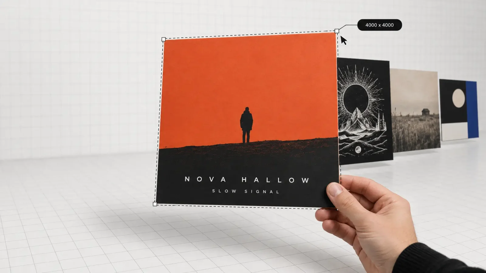
An AI album cover maker turns a text prompt or reference photo into finished artwork sized for streaming, so you get a cover that matches your genre and passes Spotify and Apple Music's technical checks without hiring a designer or opening Photoshop. The fastest way to use one well is to nail the platform specs first, then let genre and typography choices do the rest of the work.
Key takeaways
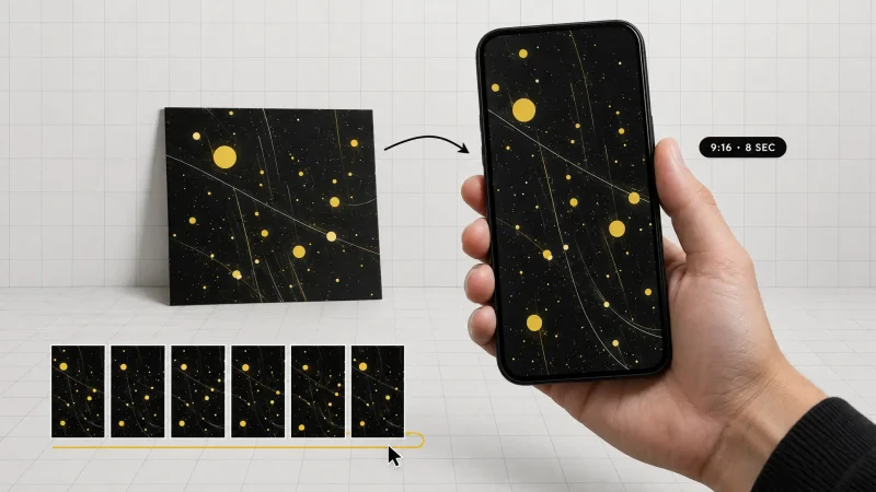
Spotify requires cover art between 640px and 10,000px per side, saved as a lossless TIFF, PNG, or JPG in sRGB, while Apple Music asks for at least 4000 x 4000 pixels in JPG, PNG, or GIF format.
Most distributors, including DistroKid, treat 3000 x 3000 pixels as the safe target size because it clears every major DSP's minimum at once.
An AI album cover maker can generate art at these resolutions directly, or you can upscale a smaller image afterward rather than resubmitting from scratch.
Genre expectations are real: a lo-fi hip-hop cover and a metal cover read as "wrong" to a listener within a second if the visual language is swapped.
Typography fails more covers than bad imagery does, so pairing an aesthetic preset with a matching type treatment matters as much as the image itself.
Cover art dimensions for Spotify, Apple Music and other DSPs
Every streaming platform checks your artwork against a technical spec before it goes live, and missing the mark is the single most common reason a release gets bounced back by a distributor. These specs are public and worth bookmarking rather than guessing at.
Spotify's own support page states that cover art needs to be TIFF, PNG, or JPG format using lossless encoding, at the highest resolution available, between 640px and 10,000px wide and tall, in a 1:1 aspect ratio, encoded with an sRGB color space at 24 bits per pixel. That wide range means Spotify will technically accept a small file, but it explicitly favors the largest clean image you have.
Apple Music is stricter. Apple's own artist support documentation specifies that cover art must be in JPG, PNG, or GIF format, a perfect square, and at least 4000 x 4000 pixels in size, with no blurry, tilted, or cropped images and no added text like pricing or social handles. That 4000-pixel floor is higher than what most other DSPs demand, so if you're building one master file to submit everywhere, size it for Apple Music and it will clear Spotify automatically.
Distributors add their own floor on top of the platforms. DistroKid's help center notes that album artwork should be delivered as a .jpg file, with a minimum size of 1000 x 1000 pixels, ideally a perfectly square 3000 x 3000 pixels, and that anything smaller or non-square gets auto-adjusted with a risk of looking different than you intended. That's the practical reason 3000 x 3000 pixels has become the informal industry default: it's comfortably above every distributor minimum and safely under Apple's higher recommendation.
A simple rule that covers almost every case: export at 4000 x 4000 pixels, square, in PNG for crisp text or JPG for a photographic look, in sRGB color. If your AI album cover maker only outputs a smaller square, an image upscaler can bring a 1500 x 1500 pixel draft up to spec without regenerating the whole piece from scratch.
How an AI album cover maker turns a prompt into cover art
Making an album cover with AI comes down to three moves: describe the mood and subject, generate at the right resolution, then refine the type. Here's what that looks like in practice.
Write a prompt that names the genre, mood, and a concrete visual anchor. "Moody synthwave album cover, neon grid horizon, single figure silhouette, 1980s VHS grain" gives a model far more to work with than "cool album cover."
Generate a few variations before you commit. Run the same prompt through two or three times, or try it against a couple of aesthetic presets, and pick the composition that leaves clean space for a title rather than the busiest option.
Add or adjust typography as a separate pass. Overlay your artist name and track title once the background image is locked, so the composition and the text don't fight for the same visual weight.
MagicShot's AI art generator handles the first two steps from a single text prompt, and because it runs on a shared credit balance with MagicShot's image, video, and voice tools, the same session can also produce a matching teaser clip or a spoken intro without switching apps. If you're starting from a band photo instead of a pure illustration, running it through a background remover first gives you a clean subject to drop onto a generated backdrop.
Genre-led design direction that actually reads
Genre signals are a shortcut a listener's eye uses before they read a single word, so fighting them usually reads as a mistake rather than originality. A few patterns show up again and again for a reason:
Indie and bedroom pop: soft film grain, muted or pastel palettes, a single candid-feeling photo rather than a composed illustration.
Hip-hop and trap: high contrast, bold central figure or object, saturated color blocking, often a heavier typeface locked to the top or bottom third.
Metal and hardcore: dense illustrated detail, dark value ranges, symmetrical or emblem-style composition that reads like a patch or a poster.
Electronic and synthwave: geometric grids, gradient skies, chrome or neon accents, and negative space that leaves room for a glowing wordmark.
Folk and acoustic: natural textures, warm and desaturated color, hand-drawn or serif type that feels printed rather than screen-native.
None of these are rules you have to follow, but a prompt that deliberately breaks the pattern, say, a pastel bedroom-pop cover for a death metal EP, reads as a genuine choice only if the typography and mood of the music actually back it up. Otherwise it just reads as a mismatch.
Typography on album covers
Type is where most self-released covers lose credibility, not the artwork underneath it. A cover has to work at three sizes at once: full screen, a phone lock screen widget, and a thumbnail roughly the size of a fingertip, so anything that only reads at full size is a design that will fail in the wild.
A few checks worth running before you export:
Shrink it to thumbnail size and squint. If the artist name blurs into the background or another element, increase contrast or move it to a cleaner part of the frame.
Limit yourself to two typefaces at most. One for the artist name, one for the title, is plenty; a third almost always looks accidental.
Match letter-spacing and weight to the genre, not just the mood board. A hairline serif on a trap cover, or a chunky graffiti font on a folk record, undercuts the rest of the image.
Keep text off the very edge. Some players and widgets crop a few percent of the frame, so a title flush against the border risks getting clipped.
Apple's own guidance is blunt about the text side of this too: it explicitly rejects cover art carrying additional information like social media handles, pricing language, or promotional text beyond the artist name, release title, and track title. That's a technical rejection risk, not just a design opinion, so keep the wording on the cover to exactly what identifies the release.
Combining an aesthetic preset with a typography preset
Pairing a visual style with a matching type treatment is the fastest way to get a cover that looks intentional rather than assembled from two different decisions. In practice, that means picking your aesthetic first, a genre-appropriate mood, palette, and composition, and only then choosing a type style built for that same register.
A workable process: generate three or four background options in MagicShot's AI art generator around a single genre-led prompt, pick the one with the cleanest negative space, then treat the type like a second design pass rather than an afterthought bolted onto the first result. A neon-grid synthwave background wants a thin, evenly spaced sans-serif that echoes the grid lines; a grainy folk photo wants a serif or hand-lettered mark that feels printed rather than rendered. If your release also needs a wordmark or logo for merch and social profiles, the AI logo generator can produce a consistent mark you carry across the cover, streaming banners, and a t-shirt design without redrawing it each time.
Since the cover, any promo clip, and a spoken announcement all draw from the same credit balance in MagicShot, it's worth generating the cover and a short teaser in the same sitting. Turning that finished artwork into a moving teaser is a natural next step with image to video, which animates a static cover into a short clip for release-day posts.
Can I use an AI album cover commercially?
Yes, on a paid MagicShot plan, generated cover art comes with a commercial license, so it can be used on streaming platforms, merch, ads, and anywhere else you release or promote the record. That covers the actual use case almost every independent artist needs: putting the art on a store page and print-on-demand merch without a separate licensing conversation.
Two things are worth checking regardless of which tool you use. First, confirm the platform's own content policy, since Apple Music and Spotify both reserve the right to reject art that misrepresents the release or infringes someone else's rights. Second, keep your original generation and any source files you uploaded, since distributors occasionally ask for a resubmission if a cover gets flagged after release.
Common mistakes that get cover art rejected or ignored
Most rejected covers fail for a handful of repeat reasons rather than anything exotic. Watch for these before you submit:
Wrong aspect ratio. A near-square image that's a few pixels off in one dimension still fails the 1:1 check; crop to an exact square before exporting.
Upscaled instead of generated at full size. Stretching a small file to hit a pixel count introduces visible softness; regenerate at the target resolution or run it through a dedicated upscaler instead of resizing in a basic image viewer.
Promotional text baked into the image. Words like "new single" or a release date on the artwork itself is a common Apple Music rejection reason, so keep that copy in your release notes, not the cover.
A composition with no room for the title. If every inch of the frame is busy, there's nowhere for text to sit without fighting the art, which is why leaving deliberate negative space during generation saves a rework later.
What makes a good album cover design?
A good album cover does two jobs at once: it reads correctly at thumbnail size, and it tells a genre-fluent listener what they're about to hear before the track starts. Everything else, color trends, illustration style, photo versus type-only, is in service of those two jobs.
The covers that hold up over time share a few traits: one clear focal point, a palette with enough contrast to survive a small screen, and type designed alongside the image rather than dropped on top of it. None of that requires a large budget, just a clear mood, a few honest variations, and the willingness to throw out the version that looks fine but doesn't match the record.