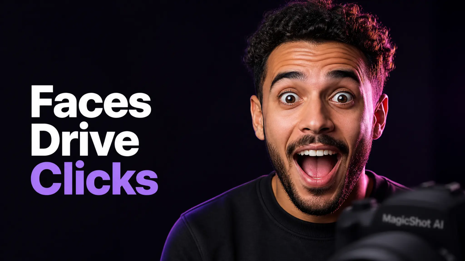
Most videos die at the thumbnail. Not the hook, not the edit, the thumbnail. You can spend three days filming and editing, and a viewer will still decide whether to click in under a second based on a 1280x720 image. Get the youtube thumbnail wrong and none of the rest matters, because the algorithm never gets a chance to test your retention.
This guide covers the technical stuff first, size, resolution, aspect ratio, safe zones, because getting those wrong is an unforced error. Then it moves into the design rules that actually move click-through rate: faces, contrast, and text you can read on a phone screen. Last, it covers the part most creators skip, generating multiple thumbnail variants and testing which one wins instead of guessing once and moving on.
If you want to skip straight to building one, MagicShot's image editing tool supports multiple aspect ratio presets and runs on top-tier image models, which matters more than it sounds once you're trying to hit an exact 16:9 crop without cutting off your own face.
Size of a YouTube Thumbnail: Resolution and Aspect Ratio
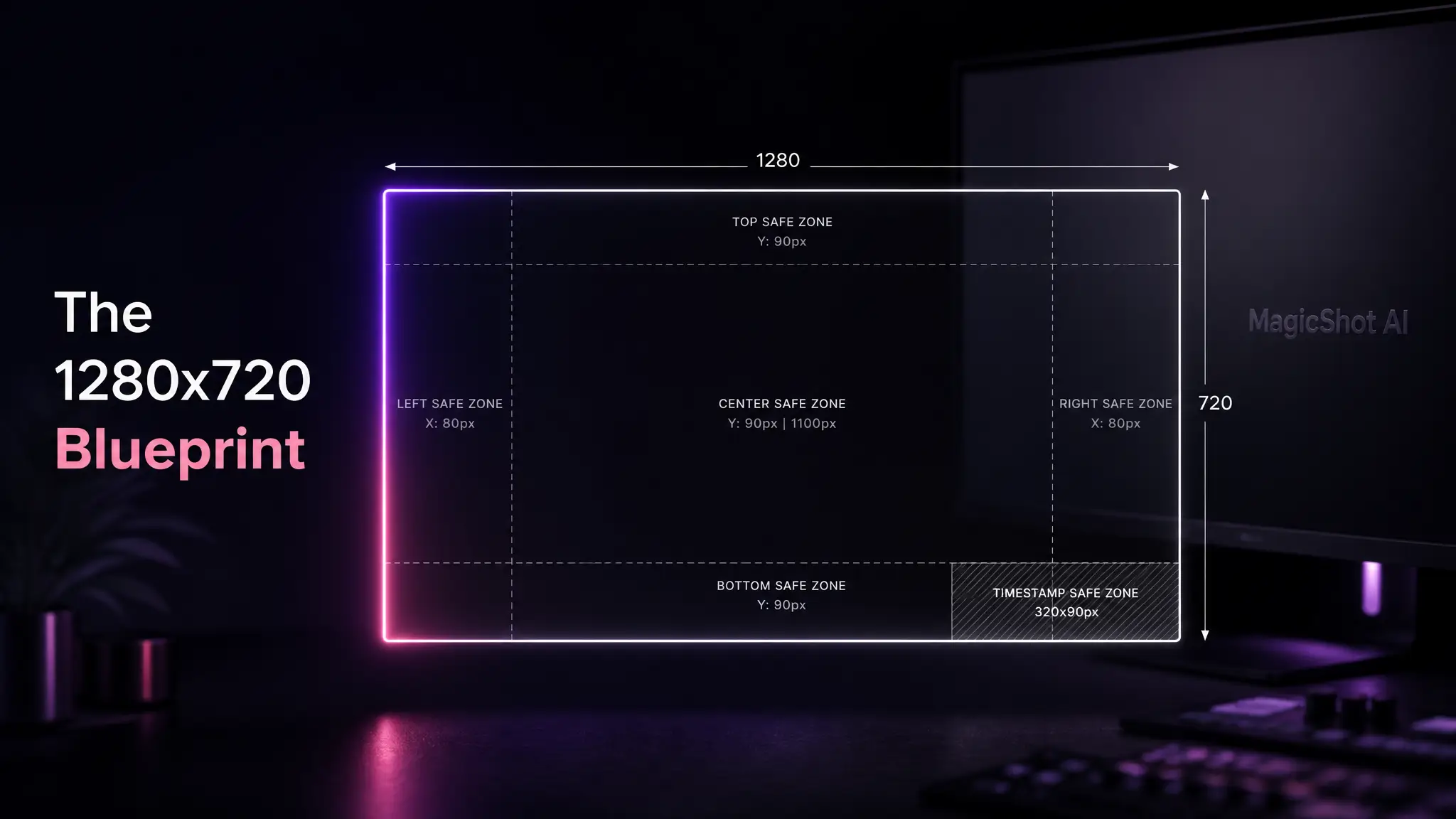
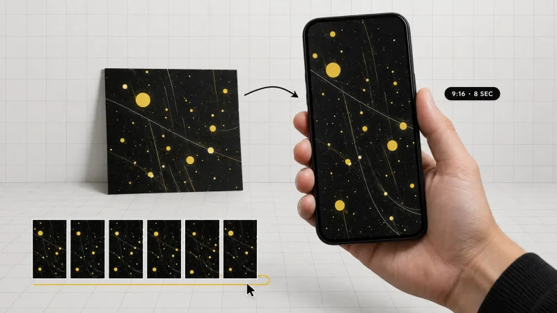
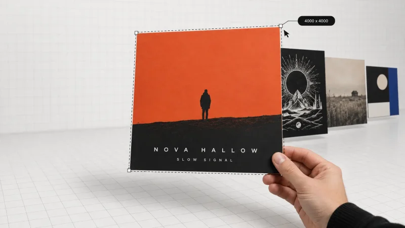
The size of a youtube thumbnail that YouTube recommends is 1280x720 pixels, with a minimum width of 640 pixels. That works out to a youtube thumbnail aspect ratio of 16:9, the same ratio as the video player itself, which is why mismatched crops look wrong immediately: black bars, stretched faces, or a title cut in half.
On youtube thumbnail resolution specifically, 1280x720 is the sweet spot. Go lower and your thumbnail looks soft next to sharper competitors in the feed. Go much higher and you're just wasting file size for no visible gain, since YouTube compresses and displays it at a fixed size anyway. File format matters too: YouTube accepts JPG and PNG, and file size limits depend on upload device, roughly 2MB on mobile and up to 50MB on desktop. Stay well under those and you avoid upload errors entirely.
One detail people miss: your thumbnail gets shown at wildly different sizes, a few hundred pixels wide on a phone's home feed, much larger on a TV app. Design at full 1280x720 resolution, but check how it reads shrunk down to the size of a postage stamp. If your title or face disappears at that size, it will disappear in the feed too.
Safe Areas: What Gets Covered on Every Device
YouTube overlays a few elements on top of your thumbnail depending on where it's shown: a video duration stamp in the bottom-right corner, progress bars on mobile, and channel branding in some layouts. None of that is optional, and none of it moves. Keep your subject's face, your key text, and any critical detail out of the bottom-right 15 to 20 percent of the frame, and give yourself a small margin on all four edges since some surfaces crop slightly.
This is where a lot of hand-made thumbnails fail quietly. The design looks fine in a full-screen preview, then the duration timestamp lands directly on the subject's eyes once it's live. Build with the corners in mind from the first draft, not as a fix afterward.
A quick way to check your own draft: open it at actual thumbnail size next to five or six thumbnails from your own subscription feed. If yours is the one that's hardest to identify in a half-second glance, the composition needs work before the duration stamp is even a factor.
How to Make a Thumbnail for YouTube: Faces, Contrast, and Text
If you're wondering how to make a thumbnail for youtube that actually earns clicks, three rules do most of the work.
A clear face beats a clever graphic. Human faces, especially ones showing an obvious emotion, shock, laughter, focus, get more clicks than text-only or object-only thumbnails. Shoot the face close, well lit, and looking either at the camera or at the point of interest in the frame.
Contrast separates you from the feed. YouTube's interface is white with dark text, and most competing thumbnails are cluttered. A thumbnail with one dominant subject, a saturated background color, and strong separation between subject and background reads instantly, even at small size. Busy, low-contrast thumbnails blend into the scroll and get skipped.
Text length limits: three to five words, maximum. Thumbnail text is a headline fragment, not a caption. If your text needs a full sentence to make sense, it's doing the title's job, not the thumbnail's. Keep it large, high-contrast against the background, and short enough to read in the time it takes to scroll past it.
Isolating a subject cleanly is where most manual edits fall apart, especially with busy backgrounds like a desk, a room, or an outdoor shot. MagicShot's background remover pulls the subject out cleanly so you can drop them onto a flat, high-contrast background without the halo edges that give away a rushed cutout.
YouTube Thumbnail Maker vs. Doing It by Hand
A youtube thumbnail maker earns its keep by removing the parts that eat time without improving the result: resizing canvases, matching a 16:9 aspect ratio exactly, and rebuilding a layout from scratch for every single video. Manual tools like layered photo editors are more flexible in theory, but most creators don't need that flexibility every week. They need a fast, consistent way to produce a thumbnail that fits the format and looks intentional.
The gap shows up fastest with faces and backgrounds. Manually cutting out a subject, correcting lighting, and placing it against a new background in a general-purpose editor can take twenty minutes per attempt. An AI-driven maker handles the crop, the ratio, and the background generation in one pass, which means you can produce more attempts in the same time you'd spend perfecting one.
Thumbnail Designer Skills You Can Replace With AI
Hiring a thumbnail designer solves the quality problem but adds a bottleneck: a turnaround time, a per-thumbnail rate, and a dependency on someone else's schedule the night before a video goes live. For channels posting multiple times a week, that cost compounds fast.
What a designer actually brings is judgment on composition, color, and hierarchy, decisions about where the eye goes first. Those decisions are teachable and repeatable: subject on one side, text on the other, one dominant color, face large enough to read small. Apply that same framework yourself with an AI image tool and you get most of the value without the wait. MagicShot's AI art generator is useful here too, for building custom backgrounds, illustrated styles, or dramatic scenes behind your subject when a plain color background feels flat.
Using a YouTube Thumbnail Template Without Looking Generic
A youtube thumbnail template is a reasonable starting point for layout: subject position, text zone, safe areas already worked out. The risk is sameness. If your channel uses the exact same template every video with only the photo swapped, viewers stop noticing individual videos and start scrolling past the whole channel out of habit.
Treat a template as a skeleton, not a finished product. Keep the proportions and safe zones consistent for brand recognition, but vary the color, the expression, and the background element enough that each thumbnail still reads as its own event. Consistency in structure, variety in content, that's the balance that keeps a channel's thumbnails recognizable without going stale.
Thumbnail Creator Workflow: Generating Variants to Test
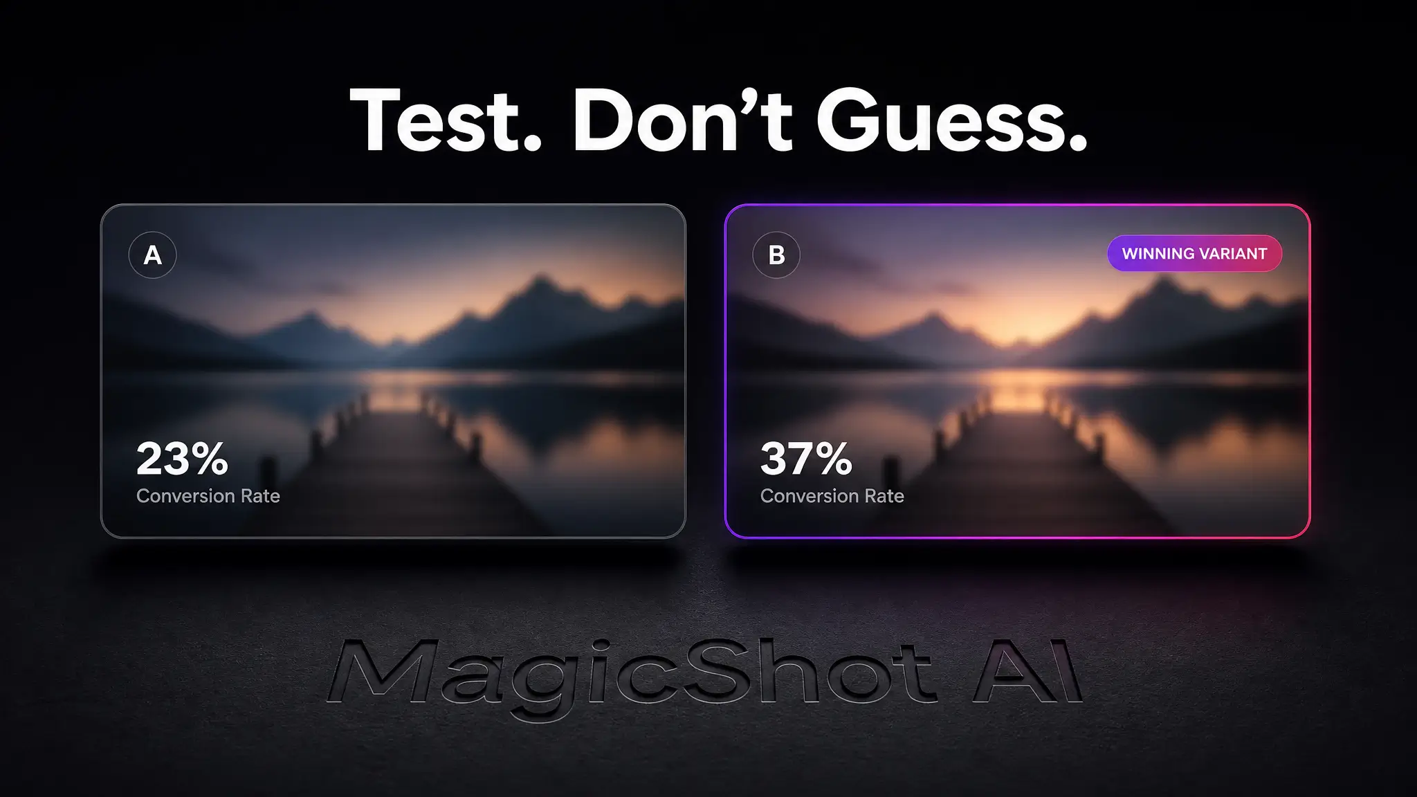
The single biggest upgrade most creators can make isn't a better design, it's making more than one design. A thumbnail creator that can output several versions from the same base photo, different backgrounds, different text placement, different crop, turns thumbnail design from a one-shot guess into an actual test.
A practical workflow: shoot or select one strong source photo with a clear expression. Run it through an image editor to generate two or three background and color variants at the correct 1280x720, 16:9 ratio. Upload one as the live thumbnail, then swap to a second version after 24 to 48 hours if click-through rate is flat. YouTube Studio's own analytics show impressions and click-through rate per thumbnail, so you don't have to guess which version won, the data tells you.
This only works if generating a variant is fast. If each version takes twenty minutes in a layered editor, most creators never bother testing at all, they just publish the first attempt and move on. That's the actual argument for an AI-based workflow: not that it looks better on day one, but that it makes testing cheap enough to actually do.
Building the Thumbnail in MagicShot
MagicShot handles this end to end inside one plan, 500+ AI models and 86+ tools, instead of stitching together a photo editor, a background generator, and a separate cropping tool. Upload your subject photo, remove or replace the background, crop to the exact youtube thumbnail aspect ratio, and export at full resolution, all in the same editor.
Start with the image editor for the crop, ratio presets, and background work. It's built to hit exact aspect ratios without manual math, and it runs on top-tier image models, which shows up in cleaner edges around hair and skin tones under different lighting, the details that make a thumbnail look intentional instead of thrown together five minutes before publish.
The Short Version
Get the size right first: 1280x720, 16:9, under the file size limit for your device. Design around the safe areas so YouTube's own overlays never cover your subject's face or your text. Keep text under five words, keep contrast high, and put a real expression in the frame instead of a stock-looking pose. Then stop treating your first draft as final. Generate two or three variants, publish, and let click-through data pick the winner.
Build the next one in MagicShot's image editing tool, where the aspect ratio presets and background controls are made for exactly this kind of fast, repeatable thumbnail work.