Twenty-nine million people play fantasy football, and every single league has one commissioner who treats the branding like it's a second job. The roster? Whatever. But the league name, the logos, the draft board, the trophy? Those get real attention. If that's you, this guide is your off-season homework. A good fantasy football logo maker and a few smart design moves can turn a group chat with a spreadsheet into something that feels like a real franchise, and it costs you a night in August instead of a designer's day rate.
Here's the honest part: most leagues stop at a default avatar and a Google Sheet. The commissioners who go further get remembered. A custom logo per team, a draft board that isn't a wall of gray cells, weekly power-rankings graphics, and a punishment trophy with a name and a face. None of it requires a design degree. All of it makes your league the one people screenshot.
Why fantasy football league identity actually matters
Fantasy is a season-long story, and stories need visuals. When your league has a logo, a look, and a running joke rendered in graphics, the trash talk lands harder and the draft feels like an event. The payoff is retention. Leagues that feel like a brand hold their members year after year, and the returning-champion energy hits differently when there's a trophy graphic with the winner's face on it.
The season peaks in August, which is when every one of these decisions gets made in a hurry. Do the work early and you show up to the draft looking like the league that has its act together. Skip it and you're the commissioner apologizing for the boring spreadsheet again.
There's a practical reason too. A league with a real identity is easier to run. When your channel has a title card, your rankings have a template, and your teams have logos, you spend less time explaining what's what and more time on the fun part. The branding does the heavy lifting so your Sunday-night posts land with zero setup.
Start with the league logo, then everything else follows
Before the individual team marks, design one league logo. This is the master brand: the colors, the type, and the tone that every other graphic borrows from. Pick two colors and a font here and reuse them on the draft board, the rankings, and the trophy. That single decision is what makes twelve different team logos still feel like they belong to the same league instead of twelve strangers who happened to show up.
Use a fantasy football logo maker to build a team logo people will actually use
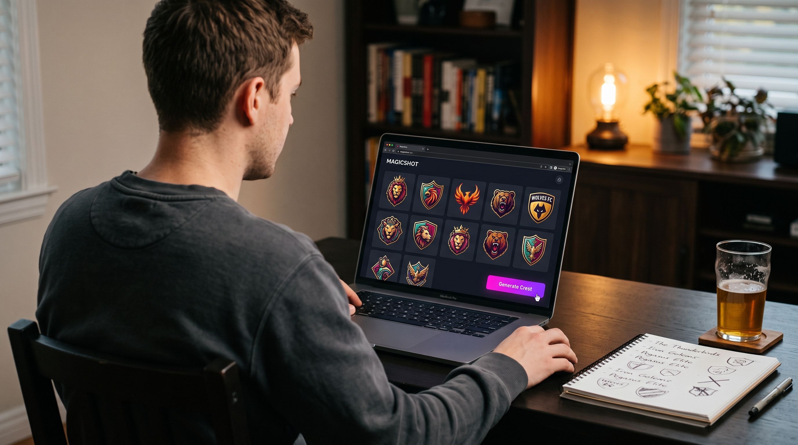
The centerpiece is the fantasy football team logo. Twelve teams, twelve identities, and half of them are puns you can't say at work. This is the part that used to mean bribing the one friend who owns Photoshop or paying a designer per logo. Skip both. A fantasy football logo maker turns a team name into a finished crest in a few minutes, and you do it twelve times in one sitting instead of chasing down favors all week.
With MagicShot's Logo Generator, you type the team name and the vibe and get a mark you can drop onto a roster. Think mascot crests, retro NFL-style badges, or something intentionally cursed to match a team called "Justin Jefferson Airplane." You describe it, you get options, you pick the one that makes the group chat laugh.
Prompt ideas that produce a usable crest
Classic sports crest: a shield or circle badge with the team name, bold serif type, two colors, clean lines. Reads great small on a roster page.
Mascot-forward: an angry animal or character head, thick outlines, a sticker-style look that survives being shrunk down.
Retro throwback: muted colors, a distressed texture, a wordmark that looks like it's from 1978.
Pure joke logo: lean into the pun. The worse the team name, the better the logo.
Once you have the mark, run it through the Image Upscaler so it stays crisp when you print it on the draft board or blow it up for the trophy. A tiny logo that turns to mush on a poster is the one design mistake everyone notices.
Draft board ideas that beat a spreadsheet
The draft is the one day your whole league is in the same room, physical or virtual, and a wall of gray cells kills the mood. Better draft board ideas start with a theme and a set of team logos, and they end with something worth photographing.
The physical board
If you're drafting in person, the move is a printed board with name plates for each team. Design each plate around that team's logo, keep the position color-coding consistent, and leave clean slots for the picks. A local print shop turns your file into a foam board in a day. Suddenly the draft has a set piece, and the photos from draft night look like a real event instead of a laptop on a kitchen table.
The digital board and reveal graphics
Running the draft online? Build a title card and per-round graphics with the AI Art Generator, using the same colors and logo style across every asset so the league looks like one brand. You can push it further with a short animated intro. Turn your league logo into a moving open with the Image to Video tool, and drop it at the top of your draft stream so the whole thing kicks off with a hype clip.
Draft board design checklist
Lock one color palette and one type style before you design anything else.
Give every team its logo, sized identically, in the same spot on each plate.
Color-code positions (QB, RB, WR, TE) so picks are readable at a glance.
Leave breathing room. A crowded board reads as chaos on draft night.
Export at high resolution, then upscale, so the print or the screen stays sharp.
Weekly power-rankings graphics that keep the group chat alive
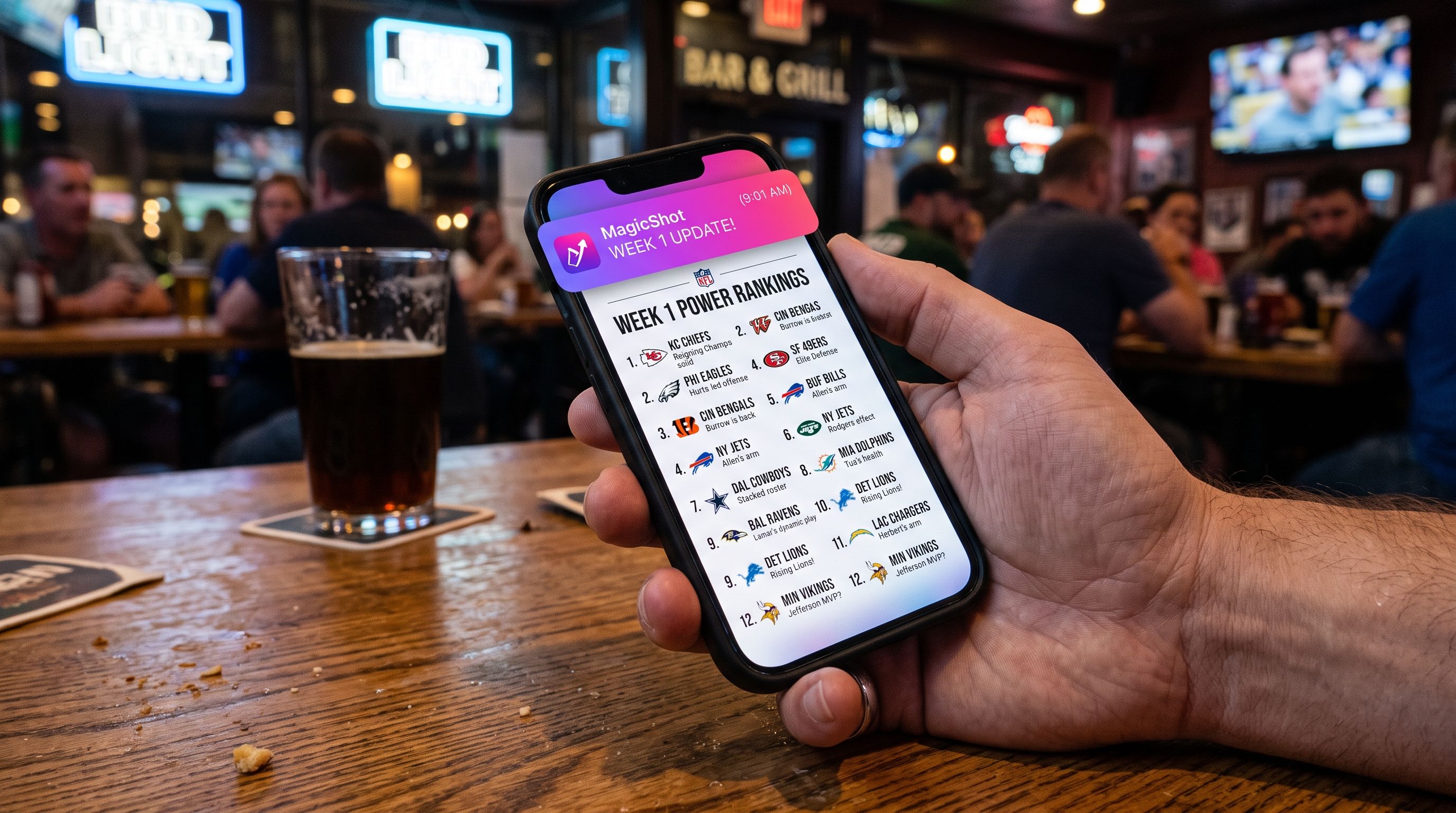
The draft is one day. The graphics that carry a season are the weekly power rankings. A ranked list with each team's logo, a one-line roast, and a consistent template gives the commissioner a Monday ritual and gives everyone something to argue about.
Build a template once, then swap the logos and captions each week. Rank one through twelve, add an arrow for who's rising and who's falling, and write the meanest caption you can defend. Keep the frame and background consistent every week, and your team logos slot right in. For extra spite, make a set of reaction stickers from the logos so the group chat has custom emotes for every blowout and bad beat.
A punishment trophy design worth fearing
The champion gets a trophy. The loser gets a story they'll never live down, and the best leagues make that a graphic. Punishment trophy design is where you go full villain: a last-place "crown" graphic, a wall-of-shame poster with the loser's face on it, or a mock magazine cover celebrating their historically bad season.
Put the loser's actual photo on it. Use the Background Remover to cut them out of a headshot, then drop them onto whatever humiliating scene fits the punishment. The threat of ending up on that poster is often better motivation than the prize itself.
For the winner, keep it clean. A championship crest with their team logo, the year, and the league name works as a graphic they'll set as a phone wallpaper for twelve straight months. Want to hand it over with a little theater? Generate a short hype reel of the season's highlights and pair it with a custom track from the AI Music Generator so the trophy presentation has a soundtrack.
Give every manager a face card
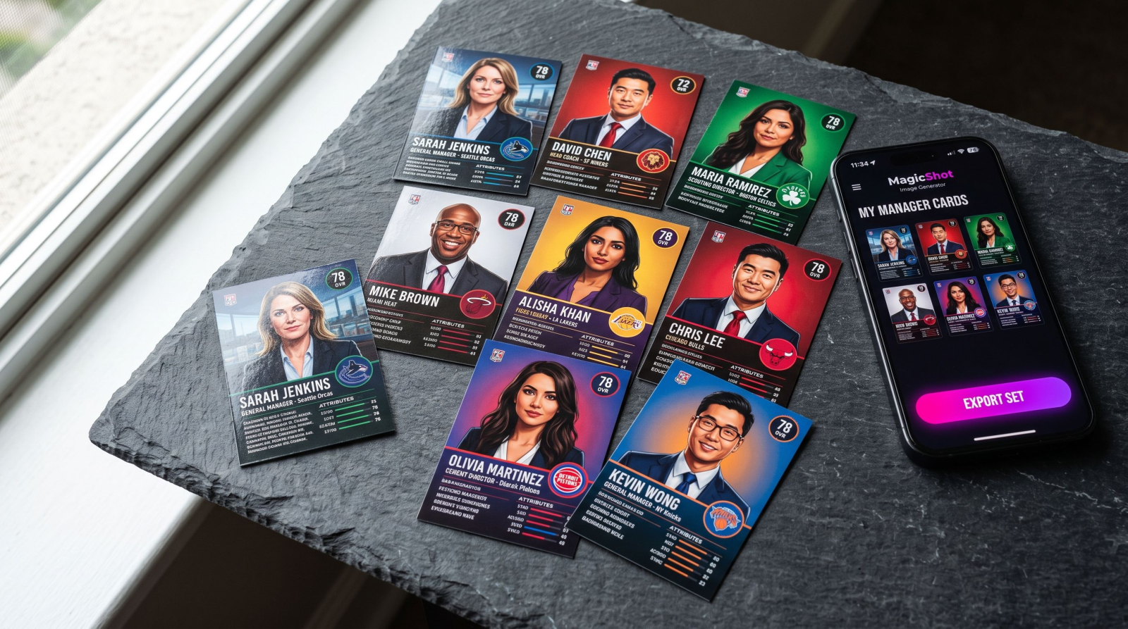
Team logos handle the franchise side. Manager cards handle the personality side. Think of the trading-card treatment: each manager gets a portrait, their team name, their record, and a tagline. It's the kind of thing that makes a rookie season feel official and gives returning champs something to defend.
Start from a clean portrait of each manager. If people only have blurry group photos, a set of professional headshots gives you consistent, sharp images to build from. Frame each one the same way, add the team logo in the corner, and you've got a full set of cards for the draft board, the group chat, or a mid-season "state of the league" post. When a new manager joins, you make one more card in the same style and the set still holds together.
Common league-branding mistakes to skip
Most bad league graphics fail for the same few reasons. Avoid these and you're ahead of nearly every league you'll ever join:
Twelve unrelated styles. One team goes photorealistic, another goes cartoon, a third uses clip art. Pick one style for all team logos and stick with it.
Tiny, blurry marks. A logo that looks fine on a phone falls apart on a printed board. Design bigger than you need, then scale down.
No template. Rebuilding your rankings graphic from scratch every week is why most commissioners quit posting by Week 5. Build once, reuse all season.
Forgetting the trophy until playoffs. Design the champion crest and the punishment poster before the season starts. The stakes feel real when everyone can already picture the poster.
Put the whole league identity together
Here's the full kit, start to finish, that takes one focused evening:
League logo and name: the master brand every other asset borrows from.
Twelve team logos: one per manager, built from the team names.
Draft board: printed plates or a digital board plus a reveal graphic.
Weekly power-rankings template: one design, reused all season.
Champion crest and punishment poster: the two ends of the story.
Keep one palette and one logo style across all of it and your league reads as a single brand instead of a pile of random images. That consistency is the difference between "nice graphic" and "our league has a look."
Wrap-up
Fantasy football is a story you tell for four months, and the branding is how you tell it. A sharp team logo, a draft board that earns a photo, weekly rankings with a bite, and a trophy nobody wants to win: that's a league people re-up for every August. Do the design work once, reuse the templates every season, and be the commissioner who took the branding seriously. The roster will let you down eventually. The graphics won't.