An AI icon generator turns a short prompt into finished icons that share the same stroke weight, grid, and corner radius, so you can build a consistent icon set in minutes instead of waiting three weeks on a freelance queue. If you have ever shipped a settings screen with one icon that looks 2px heavier than the rest, this is the fix. You describe what you need, generate variations, and keep the ones that match your system.
This post is for developers and product designers who need real icons and do not have a $600 illustration package or a spare afternoon to nudge anchor points in a vector editor. Below is how the workflow actually goes, where it saves you time, and where you still need a human eye.
What an AI icon generator actually does
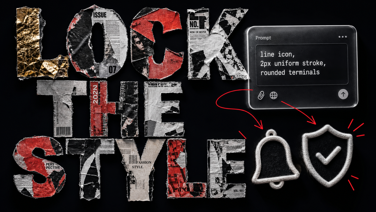
Here is the plain definition. An AI icon generator takes a text description of a symbol, a cart, a bell, a shield with a checkmark, and produces an image of that icon in the style you asked for. Good tools let you lock the style across every generation, which is the whole game. One icon is easy. Forty icons that look like one designer drew them all in a single sitting is the hard part, and that is what app icon design ai is built to solve.
The old path was slow and expensive. You brief an illustrator, wait, review, request a revision on stroke consistency, wait again, and pay per icon or per pack. The new path is a loop you control: prompt, generate, compare against the icons you already like, refine the outliers. You can build a custom icon set with the Icon Generator and iterate on the ones that miss without re-briefing anyone.
Where it fits in a product workflow
Think of icons in three buckets. Navigation and UI icons need to be dead consistent and legible at 16px and 24px. Feature and marketing icons can carry more personality and color. Empty-state and onboarding illustrations are looser still. An AI icon generator is strongest on the first two buckets, where volume and consistency matter more than a bespoke hand-drawn feel.
Why a consistent icon set is so hard to hand-build
Consistency is not one setting. It is a stack of decisions that all have to agree across every glyph:
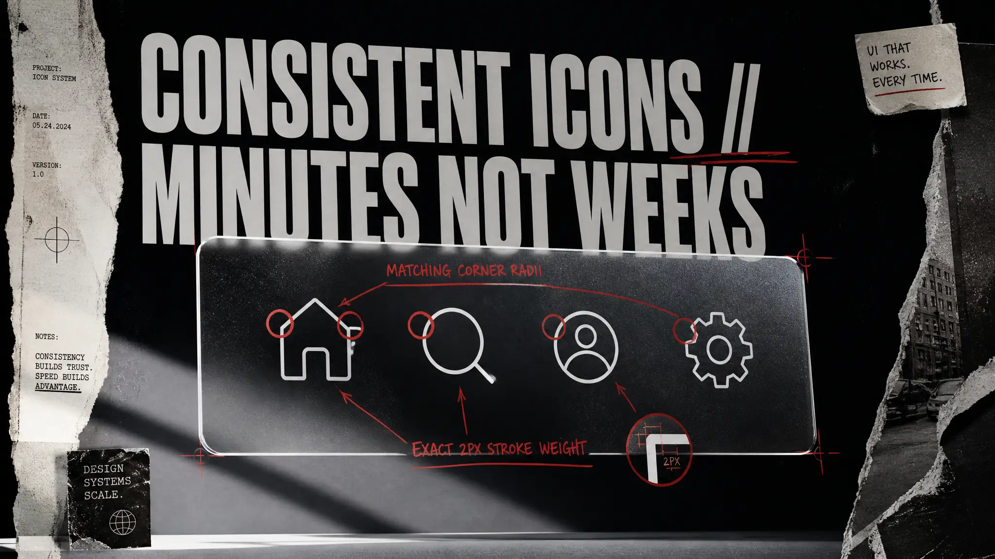
Stroke weight. A 2px line next to a 1.5px line reads as a bug, even if the shapes are perfect.
Grid and keyline shapes. Circles, squares, and rectangles should sit on the same optical grid so a round icon and a square icon feel the same size.
Corner radius. Rounded terminals on some icons and sharp ones on others break the family instantly.
Optical balance. A triangle at the same bounding box as a circle looks smaller. Real icon systems compensate for that.
Metaphor consistency. If "delete" is a trash can, "archive" should not suddenly be an X.
Doing this by hand for a 40-icon set is a genuine week of focused work. The value of a custom icon set generated with a locked style is that the machine holds most of those variables steady while you make the taste calls.
How to build a consistent icon set in minutes
This is the workflow I would hand a designer on day one. It maps to how the tool actually behaves, not a fantasy version of it.
Step 1: Define your style once, in words
Before you generate a single glyph, write your style spec as a reusable prompt block. Something like: "line icon, 2px uniform stroke, rounded terminals, minimal, monochrome, centered on a square canvas." That block goes into every prompt. Consistency starts with saying the same thing every time.
Step 2: Generate your anchor icons first
Pick the three or four icons that carry the most visual weight, usually home, search, profile, and settings. Generate those, choose the best, and treat them as your reference. Every later icon gets judged against these, not against your imagination.
Step 3: Batch the rest, then cull hard
Run the remaining icons using the same style block, swapping only the subject. Generate a few options each. Then be ruthless: keep only the glyphs that match your anchors on stroke and grid, and regenerate the ones that drift. Culling is where the set actually becomes consistent.
Step 4: Export, clean, and ship
Pull the finalists into your design file, check them at 16px, 24px, and 48px, and fix optical sizing where a shape looks too big or small. For icons that need to be true vectors in production, trace the raster output or use it as a tight reference for a quick vector pass. The AI did the exploration and the consistency heavy lifting; you do the final 10%.
Prompting an AI icon generator like a designer
The difference between a messy set and a clean one is almost always the prompt discipline. A few rules that hold up:
Lock the style words, vary only the subject. Change "shopping cart" to "credit card," never touch the style block.
Name the stroke and the shape language. "Thin line," "bold filled," "duotone," "rounded corners" all steer the output hard.
Ask for one icon, centered, on a plain background. Cluttered scenes are the enemy of clean export.
Specify the metaphor when it is ambiguous. "Notification bell" beats "alert" every time.
If you want a broader visual style before you commit to icons, it can help to explore looks in the AI Art Generator first, then carry the direction you like into your icon prompts.
Icons are one piece of a product's visual system
A consistent icon set rarely ships alone. It lands next to a logo, app store screenshots, marketing pages, and sometimes a launch video. Keeping all of that on-brand is easier when the pieces come from the same place.
When your icon set needs a matching mark, the Logo Generator keeps the same visual logic across your brand. For the store listing and marketing shots that sit around your icons, the Product Photo Generator covers the product imagery without a photographer or a rented studio. And when your launch needs a short clip, Text to Video turns a written scene into footage you can drop into a Reels or TikTok post.
What an AI icon generator won't do for you
Earning your trust means naming the limits. Raster output is not a production SVG; if your build pipeline needs crisp vectors at every size, plan a tracing or redraw step. Very abstract or brand-specific metaphors sometimes need two or three tries before the meaning lands. And pixel-perfect 16px hinting, the kind that matters for a dense toolbar, is still a human refinement. The tool removes the slow exploration and the consistency grind. It does not remove judgment.
Who this is for, and when to reach for it
Solo developers shipping a v1 who need 30 clean icons this weekend, not next month. Product designers standing up a new feature area who want to prototype an icon direction before committing engineering time. Small teams with no illustrator on staff and no budget for a $600 icon pack. If you have ever pulled mismatched icons from four different open-source packs and hoped nobody noticed the stroke mismatch, an app icon design ai workflow is the cleaner answer.
Wrap-up
A consistent icon set used to mean a brief, a wait, and an invoice. An AI icon generator turns it into a loop you run yourself: define the style once, anchor a few icons, batch the rest, and cull to a clean family. You still make the taste calls and the final vector pass, but the week of consistency grinding is gone. Start with your four anchor icons and build out from there.
FAQs
What is an AI icon generator?
An AI icon generator turns a text description of a symbol, like a bell or a shield, into a finished icon image in the style you specify. You give it a prompt and a style block covering stroke weight, corners, and color, and it outputs the icon. The real value is generating many icons that share the same look, so you get a consistent set instead of one-off graphics.
Can I build a custom icon set that all looks consistent?
Yes. The trick is to lock your style description and reuse it in every prompt, changing only the subject. Generate three or four anchor icons first, then judge every later icon against those anchors for matching stroke and grid. Regenerate any that drift. That discipline is what produces a consistent custom icon set rather than a pile of mismatched glyphs.
Does the AI icon generator export vector SVG files?
The generator produces high-resolution raster images. If your production build needs true vectors at every size, plan a quick tracing step or use the output as a tight reference for a vector redraw. For marketing pages, app store listings, and prototypes, the raster output is often ready to use as-is.
How is app icon design ai different from a stock icon pack?
A stock pack gives you fixed icons someone else drew, so you are stuck with their metaphors and their gaps. App icon design ai lets you generate the exact icons you need in your own style, including odd feature-specific symbols no pack covers. You control the look and the coverage instead of shopping for the closest match.
How long does it take to build an icon set?
For a small UI set of 20 to 40 icons, the generation and culling loop is a matter of minutes to a couple of hours, depending on how picky you are. The bulk of the time is your review and any final vector cleanup, not the generation itself. Compare that to the weeks a freelance brief and revision cycle usually takes.