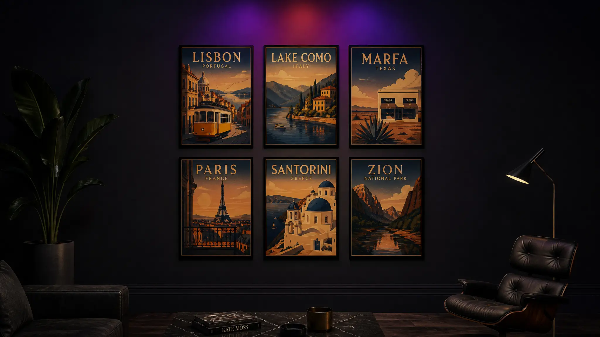
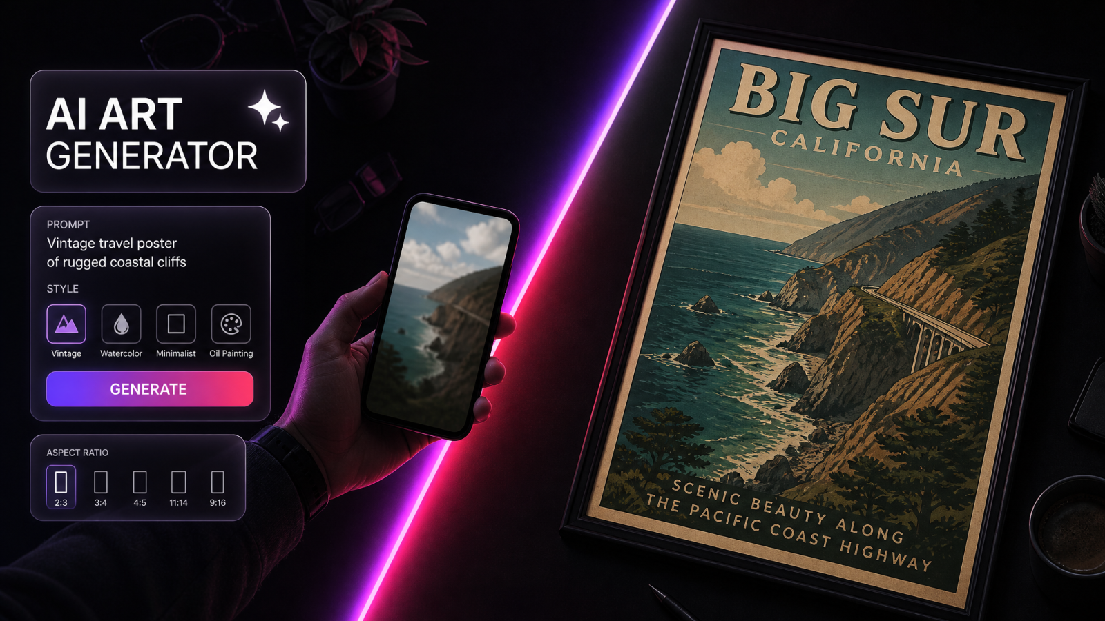
You have the photos. The blurry harbor at dawn in Lisbon, the switchback road above Lake Como, the diner sign in Marfa. What you don't have is a way to turn any of them into something worth framing. A vintage travel poster of a place you've actually been fixes that. Instead of buying a generic Paris print off a marketplace, you make a retro poster of the exact street you walked, in the same 1930s railway-ad style that made those posters collectible in the first place.
This guide covers how to do it with AI, what makes the vintage look convincing, and how to get a file that's actually sharp enough to print at A2. No graphic designer, no $300 illustration commission, no waiting three weeks for a proof.
What a vintage travel poster actually is
A vintage travel poster is a flat, illustrated print built to sell a destination. Think of the old railway and airline posters from roughly 1900 to 1960: bold flat color, a strong diagonal or a single dramatic viewpoint, the place name in condensed type across the bottom. Art Deco pushed the geometry harder in the 1920s and 30s, with sunbursts, clean sans-serif lettering, and stylized shadows.
The point of an AI vintage travel poster is to keep that grammar while swapping in your destination. You're not recreating a photo. You're translating a real place into illustration: fewer colors, simplified shapes, a confident sense of light. When it works, someone should be able to read the location from across the room before they read the label. That recognition is the whole trick. A poster of Santorini doesn't need the word Santorini on it if the whitewashed domes and cobalt sea are doing their job.
Worth knowing why these are worth copying at all. Original railway and shipping-line posters from that era now sell for hundreds to thousands at auction, precisely because the design language is so tight. You're not inventing a style. You're borrowing one that has held up for a century, and pointing it at a place you personally care about.
How to make a vintage travel poster from your own trip photos
The fastest route is text to image plus a reference photo. You describe the poster in the style you want, and you let the model do the illustration work you'd otherwise commission from an artist. Here's the workflow I use, start to finish.
1. Pick the one shot that says the place
Not your best photo. The most recognizable one. A skyline, a landmark, a coastline, a piece of local architecture. Posters live on instant recognition, so a mediocre snapshot of the Duomo beats a gorgeous photo of your lunch. If you're torn between two, pick the one with the simpler background. Detail is easy to add later and hard to remove.
2. Write a prompt that names the era and the style
Be specific. "Art Deco travel poster of Positano, Italy, 1930s, flat color, limited palette of teal and coral, geometric shadows, condensed sans-serif title at the bottom." The AI Art Generator reads that kind of direction and produces the illustration, not a filtered photo. Name the palette, the era, and the type placement every time. Vague prompts get you vague posters.
3. Clean up the reference if it needs it
If your source photo has a stray tourist, a trash can, or a parked scooter cluttering the frame, pull it before you generate. A quick pass with an object remover gives the model a cleaner starting point, and cleaner input means the illustration doesn't try to stylize distractions you didn't want.
4. Generate a few, then push the winner up in resolution
Make four or five variations. Poster type looks different at A2 than it does in a preview, so once you've got the composition you like, run it through the Image Upscaler to get a file that holds up in print. A 300 DPI A2 print needs real pixels, not a small preview stretched larger.
The details that make a retro travel poster design look real
Most AI posters fail in the same predictable ways. Fix these four things and yours will read as intentional retro travel poster design rather than a random filter slapped on a snapshot.
Limit the palette
Genuine vintage posters were printed with a handful of ink colors because printing more cost more. Three to five flat colors will always look more period-correct than a full-spectrum gradient. Pick a palette that matches the place: warm ochres and terracotta for Tuscany, cold blues and white for a Nordic fjord, dusty pink and sage for a desert town at sunset. The color story is doing half the work of naming the location.
Get the type era right
Art Deco posters lean on condensed geometric sans-serifs. Mid-century ones use rounder, friendlier faces. If your poster says "1930s Riviera" but the lettering looks like a 1970s brochure, the whole thing falls apart. Call out the type period in your prompt, and keep the title short. "NORMANDIE" reads better across the bottom of a poster than a full sentence.
Simplify the composition
One subject, one strong light source, one clear focal point. Vintage posters were meant to be read from a moving train platform. If your composition needs a caption to explain what it is, cut detail until it doesn't. A single mountain against a graphic sky beats a busy panorama every time.
Add believable print texture
A faint paper grain or a soft halftone dot pattern sells the age. Ask for "subtle lithograph texture, aged paper" rather than a heavy filter that muddies the colors. The goal is a print that looks like it came off a 1930s press, not a photo run through a sepia slider.
Turning one poster into a whole series
The reason this idea has legs: it repeats. Once you've nailed a style, every trip becomes a new poster in the same set. Ten countries, one consistent visual language, a grid on the wall that actually looks designed instead of accumulated.
To keep a series coherent, reuse the same prompt skeleton and only swap the destination, the landmark, and the palette. Same era, same type placement, same texture. That consistency is what separates a real collection from a folder of unrelated experiments. If you want to sell the set later, a simple wordmark across the bottom of each print ties the whole line together the way a real poster house would.
A practical tip for series work: keep a text file of your winning prompts. When someone asks for a poster of a city you haven't done yet, you're not starting over. You paste the skeleton, swap three fields, and generate. That's the difference between a one-off and a repeatable product.
Where people actually use these
A few named use cases that go past the fridge magnet:
Gallery walls at home. A framed set of the places you've lived and traveled beats mass-produced wall art from a big-box store, and it's yours.
Wedding and anniversary gifts. A poster of the city where you met or got engaged lands harder than another candle.
Etsy and print-on-demand shops. Custom destination posters are a proven evergreen seller. Build a template style and take custom city requests from buyers.
Short-term rental decor. Hosts hang posters of the local town to give a place character without paying a decorator.
Client and team gifts. A poster of your city's skyline is a warmer send-off than branded swag.
Once you have the still, you can go further. Drop the finished poster into image to video for a slow parallax reveal to post on Reels or TikTok, or run a batch through the AI video effects generator for a short animated version of the print. A ten-second clip of your Amalfi poster with the waves gently moving is the kind of thing that sells the physical print for you.
Prompt recipes to steal
If you want a starting point, these three cover the most common looks. Swap the bracketed parts.
Classic railway Art Deco: "1930s Art Deco travel poster of [place], flat color, teal and gold palette, geometric sunburst sky, condensed sans-serif title, subtle aged-paper texture."
Mid-century airline: "1950s airline travel poster of [place], bold flat shapes, coral and cream palette, stylized clouds, rounded mid-century title type, light halftone grain."
National park WPA style: "WPA-style national park poster of [place], muted earthy palette, screen-print texture, strong silhouette of the landscape, simple bottom banner with the park name."
Common mistakes to avoid
Two traps catch most first-timers. The first is asking for a photo when you want an illustration. If your prompt describes a "realistic photo of Rome with a vintage filter," you'll get exactly that, and it won't read as a poster. Say "illustrated poster," "flat color," "screen print."
The second is generating at preview resolution and being surprised when the A2 print looks soft. Decide your final print size first, generate the composition, then upscale before you send anything to a printer. It's cheaper to fix a file than to reprint a batch. And if you're pulling an old scanned photo as your reference, restore it first with a photo restorer so the model isn't working from creases and color shifts.
Wrap-up
A vintage travel poster of a place you've actually been is one of the rare AI projects that's both easy and genuinely worth framing. Name the era, limit the palette, keep the composition simple, and upscale before print. Do it once and you've got a template. Do it ten times and you've got a wall, a gift set, or a shop. Start with the one photo that says the place, and let the illustration do the rest.