You need a spot illustration for a blog header by end of day. The freelancer you like is booked for three weeks. Stock art all looks the same, and the good stuff costs $80 a license. An AI illustration generator closes that gap. You type what you want, pick a style, and get custom art back in seconds. No commission fee, no reshoot, no design degree.
This guide walks through what an illustration generator actually does, the styles worth knowing, how to write prompts that land on the first or second try, and where AI art still needs a human hand. It's written for the people who reach for these tools every week: marketers, sellers, indie founders, and creators who ship faster than any studio can invoice.
What is an AI illustration generator?
An AI illustration generator is a text-to-image tool that produces drawn or painted artwork from a written description. You give it a prompt like "a fox reading a book under a lamp, flat vector style, warm palette" and it renders the scene as an illustration rather than a photo. The input is text (and sometimes a reference image); the output is a downloadable image in the style you asked for.
The distinction that matters: a photo generator aims for realism, while an illustration generator leans into drawn styles. Flat vector, watercolor, line art, isometric, 3D render, storybook, comic. That's the whole point. You're not faking a camera. You're commissioning art without the commission.
Why creators reach for an illustration generator
The honest reason is money and time. A single custom illustration from a freelancer runs $150 to $500 and takes days of back-and-forth. A brand illustration set can cost thousands. Most small teams can't carry that, so they settle for clip art that screams "template."
Cost. One custom concept usually costs more than a month of most subscriptions. An illustration generator gives you dozens of drafts for the price of one commission.
Speed. A blog header, an app onboarding graphic, a set of feature icons. Minutes, not a sprint.
Consistency. Lock a style and reuse it across a landing page, a deck, and social posts so everything looks like it came from the same hand.
Iteration without guilt. Don't like the pose? Regenerate. No awkward email asking a human for the fourth revision.
Illustration styles you can generate
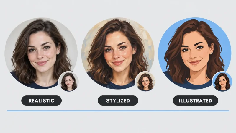
Style is the lever that separates a usable image from a generic one. Name it explicitly in every prompt. Here are the ones creators use most.
Flat vector and line art
Clean, scalable, and perfect for websites, app screens, and explainer graphics. Flat vector reads well at small sizes and pairs with brand color palettes. Line art (a single-weight outline, minimal fill) works for icons, logos, and editorial spots.
Watercolor and painterly
Soft edges, visible texture, and a handmade feel. Good for greeting cards, book covers, wellness brands, and anything that wants warmth over precision. Add "loose brushwork" or "paper texture" to push it further.
Isometric and 3D render
Isometric is the go-to for SaaS landing pages and infographics: rooms, devices, and workflows drawn at a tidy angle. A 3D render style gives you that glossy, product-launch look without opening Blender.
Storybook, comic, and character art
For kids' content, mascots, and narrative pieces. Describe the character's age, expression, outfit, and the scene, then keep those details identical across prompts to hold the character steady from panel to panel.
Retro, editorial, and poster styles
Riso-print grain, mid-century travel posters, 90s zine collage, screen-print halftones. These styles carry a strong point of view, which is exactly what editorial headers and event promos need. If your brand feels flat, a named retro style is often the fastest way to give it character. Reference an era ("1960s advertising") and a printing method ("two-color screen print") and the model will do the rest.
How to write prompts that actually work
Most weak results trace back to a vague prompt. A strong prompt is a stack of specific choices. Use this order and you'll cut your regeneration count in half.
Subject. Who or what, and what they're doing. "A barista sliding a coffee across a counter."
Style. Name it. "Flat vector illustration," "soft watercolor," "bold comic ink."
Composition. Framing and layout. "Centered, plenty of negative space on the left for text."
Color. A palette or mood. "Warm oranges and cream," "muted pastels," "two-color duotone."
Details. Lighting, texture, era, extras. "Morning light, grain texture, 1970s poster feel."
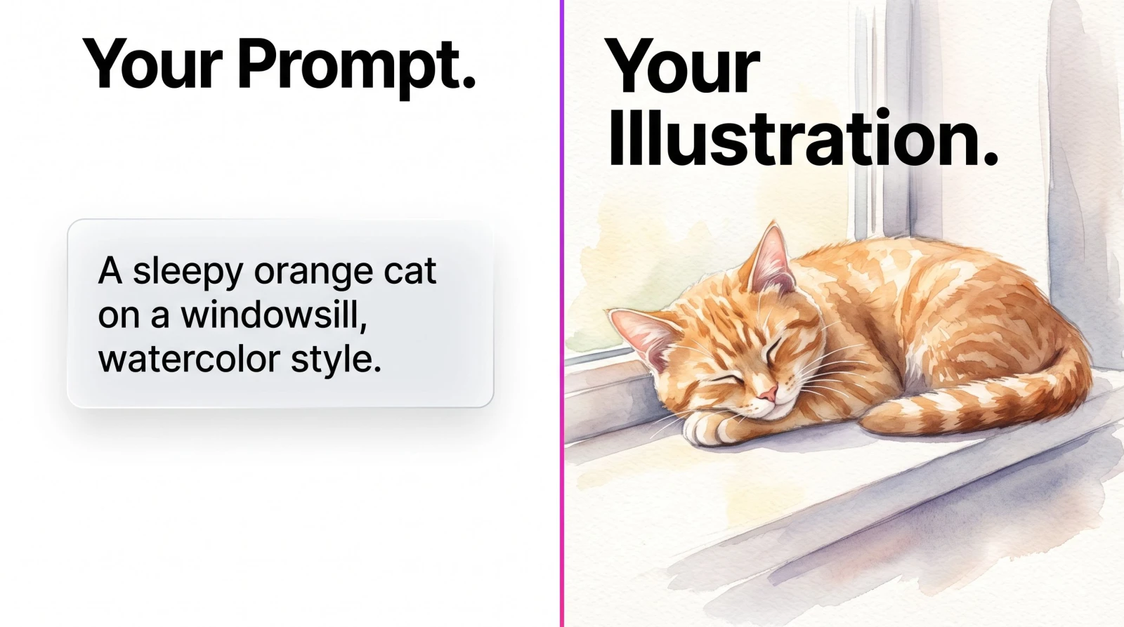
A quick example. Instead of "a cat illustration," write "a sleepy orange cat curled on a windowsill, flat vector style, soft pastel palette, large empty area top-right for a headline, gentle morning light." The second prompt tells the model what to draw and leaves room for your copy.
Rule of thumb: if you can't picture the exact image from your own prompt, the model can't either. Add one more concrete detail.
AI illustration vs stock art vs hiring a freelancer
Each option solves the same problem at a different cost. Knowing when to use which saves you both money and frustration.
Stock art is instant and cheap per download, but everyone else has access to the same library. Your "unique" header shows up on three competitor sites. It also rarely matches your exact scene or palette, so you compromise on the brief.
Hiring a freelancer gets you a real creative partner and full custom work, which matters for a flagship brand identity. The tradeoffs are the $150 to $500 per piece, the scheduling, and the revision cycles that stretch a same-week need into a two-week wait.
An AI illustration generator lands between them. You get custom output that matches your prompt, dozens of variations in an afternoon, and the ability to keep tweaking until it's right. The catch: you're the art director doing the finishing.
The practical answer for most teams is a mix. Use an illustration generator for the high-volume, fast-turnaround work (blog headers, social graphics, deck art) and save a freelancer's hours for the one or two pieces that define the brand.
Step by step: from prompt to finished illustration
Here's the actual workflow, start to finish, for a typical blog header.
Write the prompt. Subject, style, composition, color, details, in that order. Add "space on the left for a headline" if you'll overlay text.
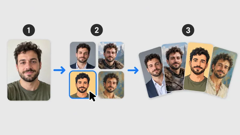
Generate a batch. Make four to eight versions rather than one. Variety shows you which direction the model reads best.
Pick and refine. Choose the strongest draft, then adjust the prompt for pose, color, or crop and regenerate just that idea.
Clean up. Cut the background if you're compositing, and remove any stray artifacts with a light edit pass.
Scale and export. Upscale to your final resolution, then export in the format your platform needs.
The whole loop takes minutes once you've done it a few times. Compare that to briefing a human, waiting, and reviewing rounds.
Building a consistent illustration set for your brand
One good image is easy. A cohesive set is where brands win. The trick is to fix your variables and change only the subject. Keep the same style keyword, the same palette description, and the same composition rules across every prompt, then swap out what the illustration depicts.
For example, a fintech onboarding flow might need five illustrations: a wallet, a chart, a shield, a handshake, a checkmark. Write all five with the identical style line ("flat vector, two-color duotone in navy and mint, soft rounded shapes, generous white space") and you get a set that looks designed by one hand. That same discipline carries into your other assets. If you're also producing a matching logo or product graphics, reuse the palette and shape language so the whole brand feels intentional.
Where illustrations fit in a real workflow
An illustration rarely ships alone. It's one piece of a page or a campaign, so it's worth knowing what to pair it with. Once you have the art, you'll often want to clean it up, resize it, or drop it into motion.
If you plan to place your illustration on a colored section or composite it with other elements, run it through a background remover to get a clean cutout. Need it bigger for a print piece or a hero banner? An image upscaler pushes resolution up without the crunchy edges. And when a static illustration should move, feeding it into an image-to-video tool turns a single frame into a short animated clip for Reels or a product page.
For broader creative work beyond drawn styles, the AI art generator covers painterly and experimental output when you want to stretch past clean illustration.
Practical use cases that pay off
Blog and newsletter headers. A matching illustration per post beats recycled stock and makes an archive feel intentional.
App and product graphics. Onboarding screens, empty states, and feature icons in one consistent style.
Social content. Carousels and quote graphics that look designed instead of dashed off. Sellers use illustrated hero images to stand out in a feed of photos.
Merch and print. T-shirt art, stickers, tote designs, and posters. Generate the concept, upscale, and send to print.
Pitch decks and reports. Custom diagrams and section dividers that don't look like everyone else's slide template.
What AI illustration still can't do for you
Being honest keeps the tool useful. AI illustration generators are fast and cheap, but they have edges.
Text inside images is unreliable. If your illustration needs clean lettering, add it yourself afterward rather than trusting the render. Exact brand-matching (a specific logo, a trademarked character, a precise color code) is hit or miss, so treat the output as a strong base you finish, not a final master. And complex hands, dense crowds, and intricate machinery still trip up most models. Simplify the scene or plan a light cleanup pass.
Think of it as a fast, tireless junior illustrator. It gives you ten good options before lunch. You're still the art director.
Getting a usable result on the first try
A short checklist that saves regenerations:
Name the style in the prompt every single time.
Describe negative space if you need room for text.
Generate a batch, then pick and refine rather than chasing one perfect prompt.
Keep character details word-for-word identical across a series for consistency.
Export at the largest size available, then upscale if you need print resolution.
The MagicShot illustration generator handles the prompt-to-art step; the rest of the MagicShot toolset handles the cleanup and delivery around it.
The takeaway
An AI illustration generator replaces the slowest, priciest part of visual work: waiting on a commission that may or may not match your brief. You describe the image, name the style, and iterate until it's right, all in the time it used to take to write the brief. Keep your prompts specific, expect to finish the details yourself, and you'll ship custom art on a schedule no studio can match.