Every app, website, and pitch deck needs icons, and almost nobody has a designer on call to make them. That's the gap an icon AI generator fills. Type a description, get a clean, consistent icon back in seconds, no icon pack subscription, no freelancer thread, no mismatched styles pulled from three different stock sites.
MagicShot's Icon Generator turns a short prompt into a ready-to-use icon, and this guide covers what an icon AI tool actually does, where it fits in a real workflow, and how to get results that look like they came from one designer, not five.
What Is an Icon AI Generator?
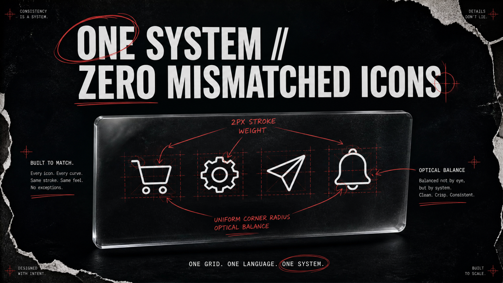
An icon AI generator is a tool that creates original icon artwork from a text prompt instead of pulling pre-made graphics from a library. You describe the icon, a shopping cart, a settings gear, a paper airplane for "send", and the model generates a new image built around that description, in a style you choose.
The difference between this and browsing a stock icon site matters more than it sounds. Stock libraries give you whatever already exists. An AI icon generator gives you the icon you actually need, sized and styled for your product, without hunting through thousands of results hoping one is close enough.
Why Teams Are Switching to Icon AI Tools
Most teams land here after hitting one of three walls: the icon pack they bought doesn't have the one icon they need, the freelancer who made their last set is slow to respond, or their app's icons look like they were sourced from five different designers because, honestly, they were. Icon consistency is one of those details users notice even when they can't say why an interface feels "off."
An icon creator that generates everything in-house solves the consistency problem by design. Every icon comes from the same prompt style and the same tool, so a settings icon and a notifications icon actually look like they belong to the same product.
No per-icon licensing fees. Stock icon sites often charge per download or lock full sets behind a subscription you don't otherwise need.
No waiting on a designer. A prompt takes seconds; a freelance turnaround takes days, and a full custom icon set from a freelancer commonly runs well into the hundreds of dollars.
No mismatched styles. Generate your whole icon set from one tool instead of stitching together icons from different sources.
Iteration without extra invoices. Want the gear icon slightly rounder or the arrow thinner? Regenerate it, no revision request needed.
How MagicShot's Icon Generator Works
The Icon Generator is built around a simple loop: describe it, generate it, refine it.
1. Describe the icon
Write what the icon represents and the style you want, for example "a minimal line-art icon of a cloud with an upward arrow, flat design, single color." Specific prompts beat vague ones every time.
2. Generate the icon
The tool renders the icon based on your description. Because it's generating fresh artwork rather than matching against a stock database, you can ask for concepts that don't exist as pre-made icons, a very specific product feature, a mascot-style mark, a niche industry symbol.
3. Refine and export
If the first result isn't quite right, adjust the prompt and regenerate. Once you're happy with it, export the icon for use in your app, site, or deck.
Icon Styles You Can Generate
Not every product needs the same look, and a decent icon AI generator should flex with the brief rather than forcing one visual style on every request. Common styles worth naming in your prompt include:
Flat and minimal. Solid shapes, no gradients, no shadows. This is the default for most SaaS dashboards and mobile apps because it stays legible at small sizes.
Line art / outline. Thin strokes, open shapes, often single-color. Common for navigation bars and settings menus where a lighter visual weight fits better.
3D and glassmorphism. Depth, soft shadows, a glass-like sheen. This style shows up a lot on marketing pages and app store screenshots because it reads as more premium.
Duotone. Two colors, usually a brand color plus a neutral, used to tie icons directly to a specific palette.
Isometric. A pseudo-3D angled perspective, popular for explainer graphics and "how it works" sections.
Naming the style up front saves a regeneration cycle. "A gear icon" and "a flat, single-color gear icon with rounded teeth" will not produce the same result.
Where AI-Generated Icons Actually Get Used
App and software icons
In-app iconography, navigation icons, empty-state graphics, onboarding illustrations, all benefit from a consistent visual language. Teams building an MVP without a design hire often use an icon maker to cover this ground fast instead of delaying launch for custom illustration work.
Web and UI design
Feature callouts, pricing table checkmarks, service page icons, these small graphics do a lot of work on a landing page. A generated icon set that matches your brand colors reads as more intentional than generic stock icons every visitor has seen on ten other sites.
Presentations and pitch decks
Investor decks and sales presentations lean on icons to break up text-heavy slides. Custom icons that match your brand palette look more polished than the default icon library baked into your slide software.
Social and marketing graphics
Icons show up in carousels, infographics, and highlight covers. Pairing generated icons with a broader visual toolkit, like MagicShot's AI Art Generator for full illustrations or the Sticker Maker for standalone social graphics, keeps an entire content calendar visually consistent without hiring an illustrator.
Icons for E-commerce Sellers and Solo Founders
Etsy and Shopify sellers run into the icon problem constantly, whether it's shipping and returns icons for a product page, category icons for a storefront, or small trust badges next to a checkout button. Hiring a designer for a handful of small graphics rarely makes financial sense when the whole job takes minutes with a prompt-based tool instead. Solo founders building a first product face the same math: a full custom icon set from a freelancer can run past $200, while an in-house icon generator handles the same ground for whatever's already included in a MagicShot plan.
This is also where consistency pays off commercially. A storefront with icons that all share the same stroke width and color feels more trustworthy at a glance than one with icons dragged in from five different free icon sites, each with its own subtle style quirks.
Icon AI vs. Stock Libraries vs. Freelancers
It helps to see the options side by side, because each one solves a slightly different problem.
Stock icon libraries (Flaticon, Iconfinder, and similar) are fast but limited to what already exists, and popular icons get reused across thousands of other products.
Freelance designers deliver custom, on-brand work but cost real money per set and take days for revisions.
An icon AI generator sits between the two: custom output like a designer, generation speed like a stock site, at a fraction of the per-icon cost of hiring out the work.
None of these fully replace a dedicated designer for a company's core logo work, but for the dozens of small icons a product actually needs, an icon generator covers most of the ground without the overhead.
Tips for Better Icon Prompts
The quality gap between a mediocre AI icon and a genuinely usable one usually comes down to the prompt. A few things that consistently help:
Name the style, not just the subject. "Flat," "line art," "3D glass," "duotone," and "outline" all produce very different results from the same subject.
Specify color intent. "Single color on transparent background" reads very differently to the model than "full color with gradient."
Keep the subject simple. Icons work best as one clear idea, a bell, a folder, a checkmark, not a busy scene. Complexity that reads fine in a full illustration usually gets muddy at icon size.
Generate variations before settling. Try two or three phrasings of the same concept and compare which one holds up when scaled down to 24px or 32px, the size it'll actually ship at.
Reuse the same prompt structure across a set. If your first icon prompt is "flat, single-color, rounded corners," keep that exact phrasing for every icon in the set so the whole batch stays visually matched.
Building a Full Visual Kit Around Your Icons
Icons rarely live alone. Once a set is generated, most teams need it to work alongside a logo, a set of brand illustrations, and sometimes stickers for social use. MagicShot's Logo Generator handles the primary brand mark, while the icon set covers the smaller supporting graphics, so the two can be built to share a palette and line weight instead of feeling like they came from different companies.
If an icon comes out slightly soft or needs to be used at a larger size than it was generated for, running it through the Image Upscaler sharpens the edges without the blur you'd get from just stretching the original file. It's a small step but it matters the moment an icon shows up on a big presentation screen instead of a phone.
Favicons, App Icons, and Sizing Considerations
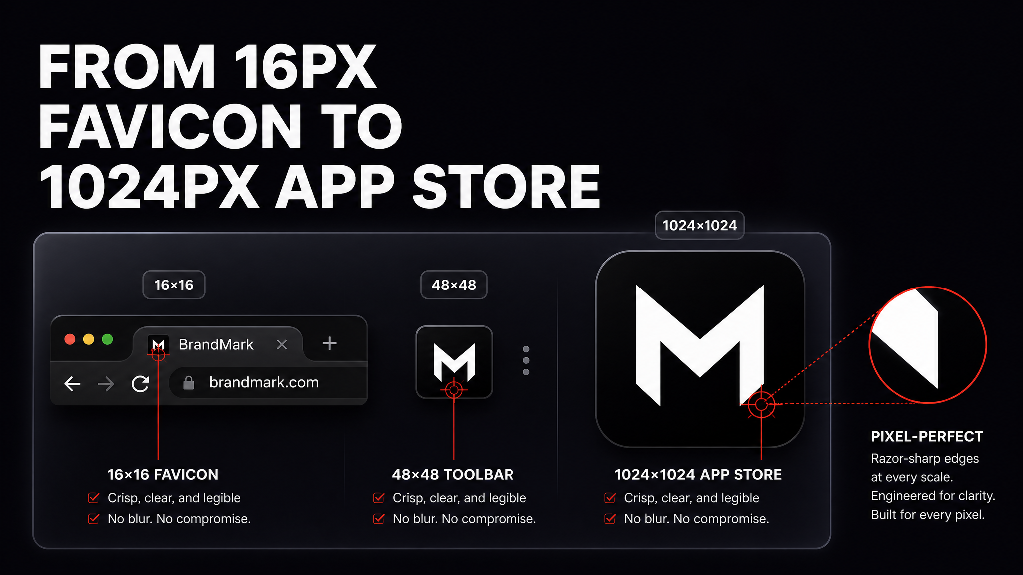
An icon that looks great on a 1200px mockup can fall apart at 16px in a browser tab. Before finalizing a set, it's worth checking each icon against the sizes it'll actually be used at: a favicon typically needs to read clearly at 16x16 and 32x32, an app store icon usually needs a clean 512x512 or 1024x1024 square with no transparency, and in-app UI icons are often as small as 24x24. Generating an icon is only half the job, confirming it still reads clearly at its smallest real-world size is what separates a usable icon from one that needs a redo.
This is also why simple concepts consistently outperform detailed ones. A folder with a plus sign scales down cleanly. A folder with a plus sign, a shadow, a gradient, and a small badge in the corner usually turns into a smudge at favicon size. When in doubt, generate the simpler version first and add detail only if the icon is meant to be viewed larger, like on a pricing page or a feature graphic.
Common Mistakes When Generating Icons
A few patterns show up repeatedly with anyone new to prompt-based icon generation:
Switching styles mid-set. Generating one icon as "flat" and the next as "3D" produces a set that looks like it came from two different products. Lock the style language early and reuse it.
Over-describing the subject. A prompt with five adjectives for a single small object often confuses the output more than it clarifies it. Simpler prompts tend to produce cleaner icons.
Ignoring background needs. If the icon needs to sit on a colored button or a dark navigation bar, say so in the prompt, or plan to run it through a Background Remover afterward to isolate it cleanly.
Skipping the small-size check. An icon that looks polished at full size but blurs into a gray blob at 16px hasn't done its job. Always preview at the smallest size it'll actually ship at.
Getting Started
An icon AI generator won't replace a full design team for a company that needs a complete brand system built from scratch. But for the day-to-day reality of shipping a product, a landing page, or a deck that needs a dozen small graphics by Friday, it removes the bottleneck entirely. Open the Icon Generator, describe the icon you need, and see what a prompt-based workflow saves you compared to the usual stock-and-scroll routine.