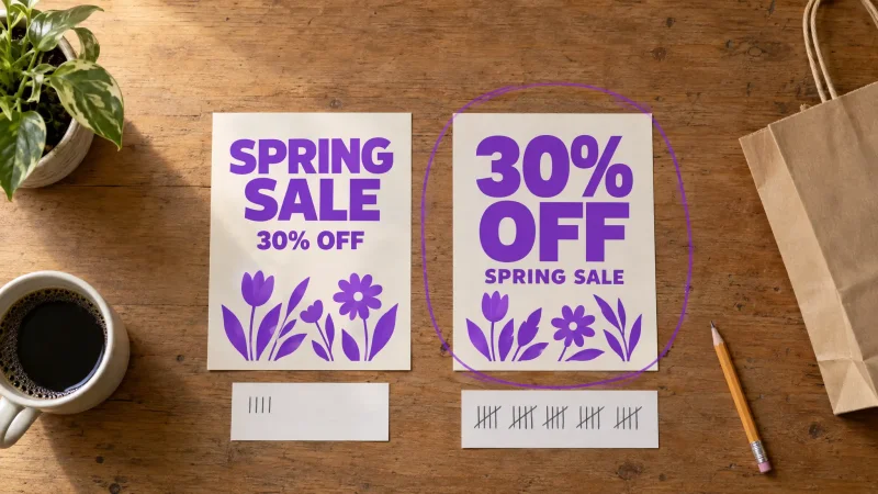
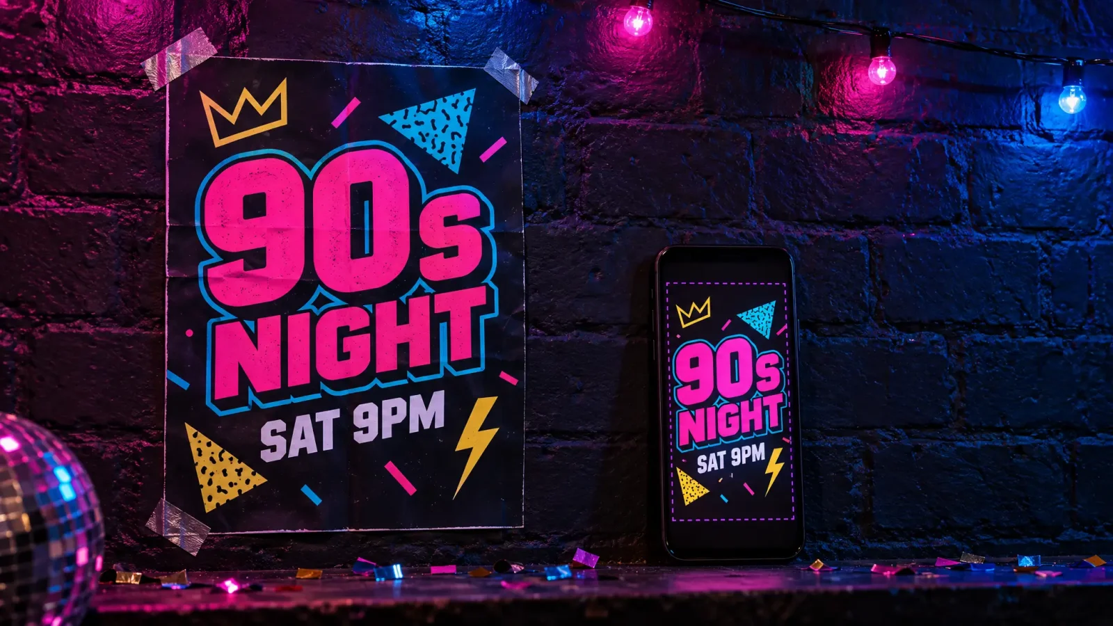
A party flyer maker only matters if the flyer actually gets opened. Most party flyers die in a group chat because the key detail is too small to read at thumbnail size, or the design has no single focal point to stop a thumb mid-scroll. The fix is not more decoration. It's picking one bold focal point and making sure the essentials survive being shrunk to a two-inch preview.
What a Party Flyer Maker Should Optimize For
A party flyer gets seen in three places: a full-screen share, a group chat thumbnail, and a phone screen glanced at for two seconds. Design for the worst case, the thumbnail, and the full-screen version takes care of itself. That means one strong visual anchor (a color, a shape, a mood) instead of five competing elements, and text sized so the event name and date read clearly even shrunk down.
A digital flyer built this way holds up whether someone opens it full-size or just glances at a preview before scrolling past.
Themed Examples That Get a Second Look
A neon 90s throwback party works because the palette alone signals the theme before anyone reads a word: hot pink, electric blue, chunky retro type. A backyard summer cookout flyer works with warm, sunlit tones and a simple graphic (a grill, a string of lights) rather than a busy photo collage. A formal fundraiser gala leans the opposite direction: restrained color, elegant serif type, generous white space so it reads as upscale rather than crowded.
In each case the theme dictates the aesthetic layer first, then the typography adapts to match the mood (playful and bold for the throwback party, refined and spaced out for the gala).
Sizing for Where People Actually See It
A flyer meant for a printed poster and a flyer meant for an Instagram Story need different proportions. A poster is usually vertical and viewed up close; a Story is full-screen vertical on a phone and viewed for a couple of seconds while scrolling. Generating a Story-specific version means keeping the critical text (date, time, RSVP link) inside the safe zone that isn't covered by app interface elements.
Build your invite with the Event Flyer Maker, then export both a print-ready size and a Story-friendly vertical crop from the same design so you're not starting over for each platform.
Keeping It Legible at Thumbnail Size
Before sending a flyer out, shrink it down on your own screen to roughly the size it will appear in a chat thread. If the event name and date are still readable at that size, it's ready. If not, increase the size gap between the headline and the supporting details, or simplify the background so text has more contrast to sit against.
For the underlying AI flyer generator workflow this legibility rule sits on top of, see How to Make a Flyer With AI in Under 5 Minutes.